10 Key Home Decorating Tips: #4 COLOR
February 5, 2019
If you have plans to decorate or redecorate a space, consider breaking the process into steps. Following an orderly progression of tasks will prevent off-the-cuff, later-regretted decisions, while also deterring you from jumping the gun and purchasing something (or a load of things) that don’t come together well within your space. And, importantly, following a process will make the endeavor less overwhelming and much more enjoyable! There are 10 steps in particular that I think can really help. In my last blog I discussed steps 1, 2 and 3: nailing down your style and atmosphere goals and getting inspired. Once you’ve tackled those you are ready for step 4, color!

Selecting a color palette is one of the most impactful decisions you will make when planning your home decor. No pressure, right? So, where to begin? Break this looming question down by following a few basic rules:Five or Six Colors

It’s essential to achieve a balance between using one color for your entire home interior, and using different colors in every room. You will tire of both of these extremes quickly. So where do you draw the line? The best bet is to use a palette of five to six colors* and stick with them throughout. I am not only referring to paint, but to furniture, artwork and other interior elements. If the main elements of your decor come from a palette of five or six a majority of the time, you will achieve a natural flow of color throughout your home, where the rooms merge nicely without being too uniform or even worse, completely unrelated.
So, you will want to pick...
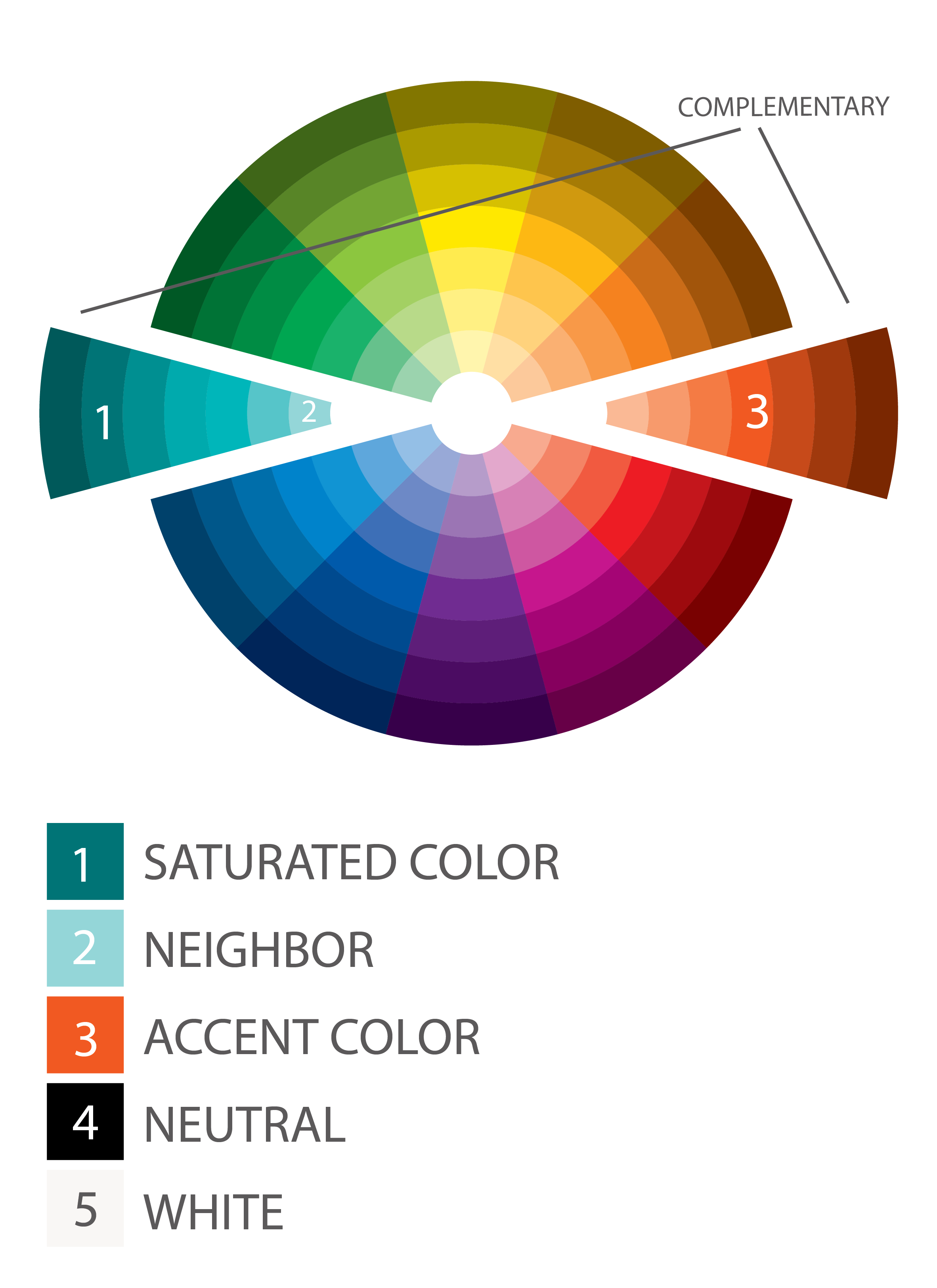
1 saturated color
1 or 2 neighbors to your saturated color (more on this below)
1 accent color
1 white**
1 neutral***
* HeyThereHome.com and SchoolOfDecorating.com both discuss using a 5 color palette.
** There are many whites out there! Check out this article by ABeautifulMess.com for advice on picking the right one!
*** Neutrals do not have to be tan or grey...you can also use black, midnight blue etc. Here’s a great article by Live Colorful to give you some ideas.
Use Color Theory to Guide Your Choices
Combining color can be a tricky business. Just because you love two colors doesn’t mean they will do well in a room together. Knowing just a little bit about Color Theory can go a long way. To achieve a harmonious combination try one of these three color schemes:

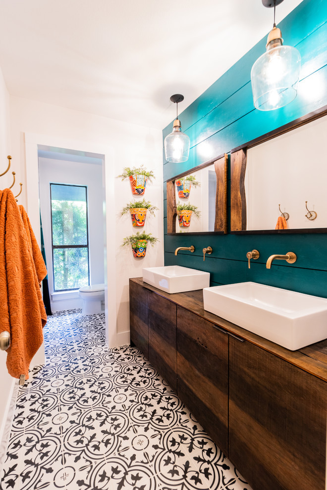
Opposites attract, right? Well, a complementary color scheme brings this idea into full view. Complementary colors are those that are opposite one another on the color wheel, as the blue-green and red-orange are above. A complementary color palette can be lively, fresh, decadent or soothing depending on the saturation of the colors you choose, and will always be pleasing to the eye.
Use the five color palette rule with a complementary color scheme and choose a shade of your saturated color as the “neighbor”. Here’s a great example:
(Image Courtesty of architectureartdesigns.com)
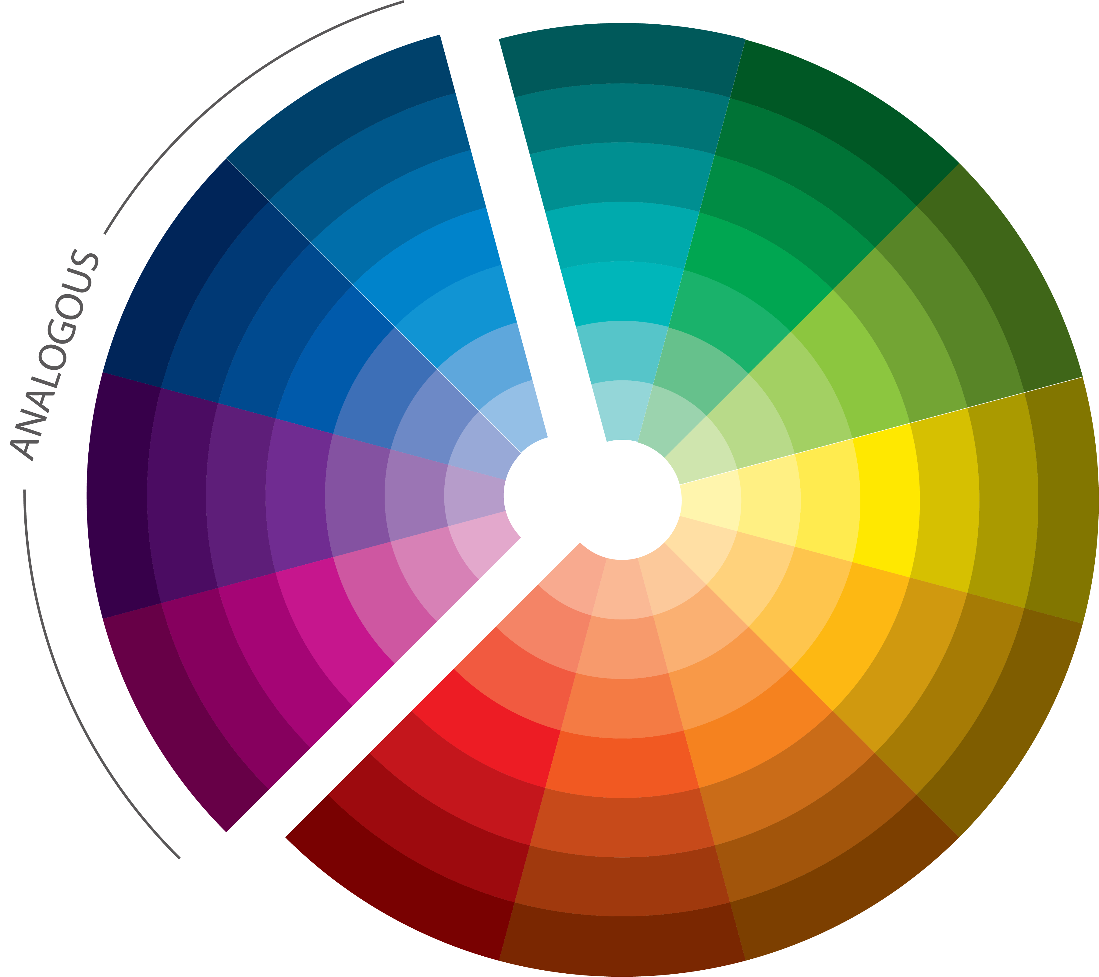
An analogous color palette is another way to create a harmonious interior. Analogous colors are those that are next to one another on the color wheel. Depending on the detail in your color wheel, you will generally want to choose 3 or 4 colors that are adjacent to one another. Analogous color schemes, often found in nature, can create a calm, interesting and/or playful space. Here is an excellent example of a room with an analogous color scheme along with a possible accompanying five color palette.
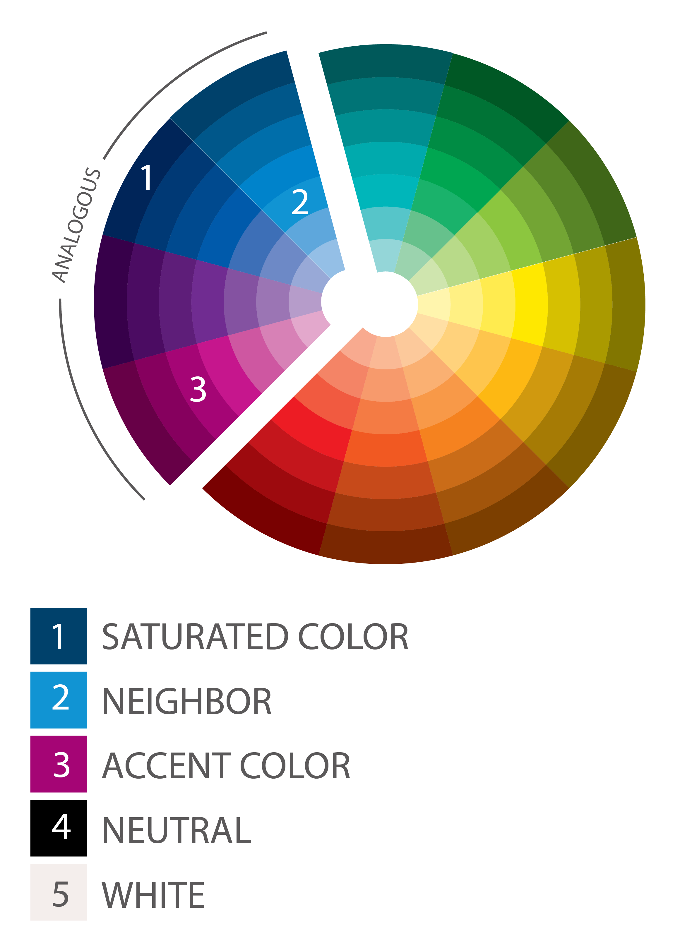
Notice in the above palette that we skip the purple colors that fall within our four adjacent wedges of the wheel. That is perfectly OK. If you are not a purple fan like me, you can exclude it from your decor altogether. If you do like purple you can throw in a few small accents here or there. With an analogous color scheme you can go either way as long as you stick to your palette a majority of the time.
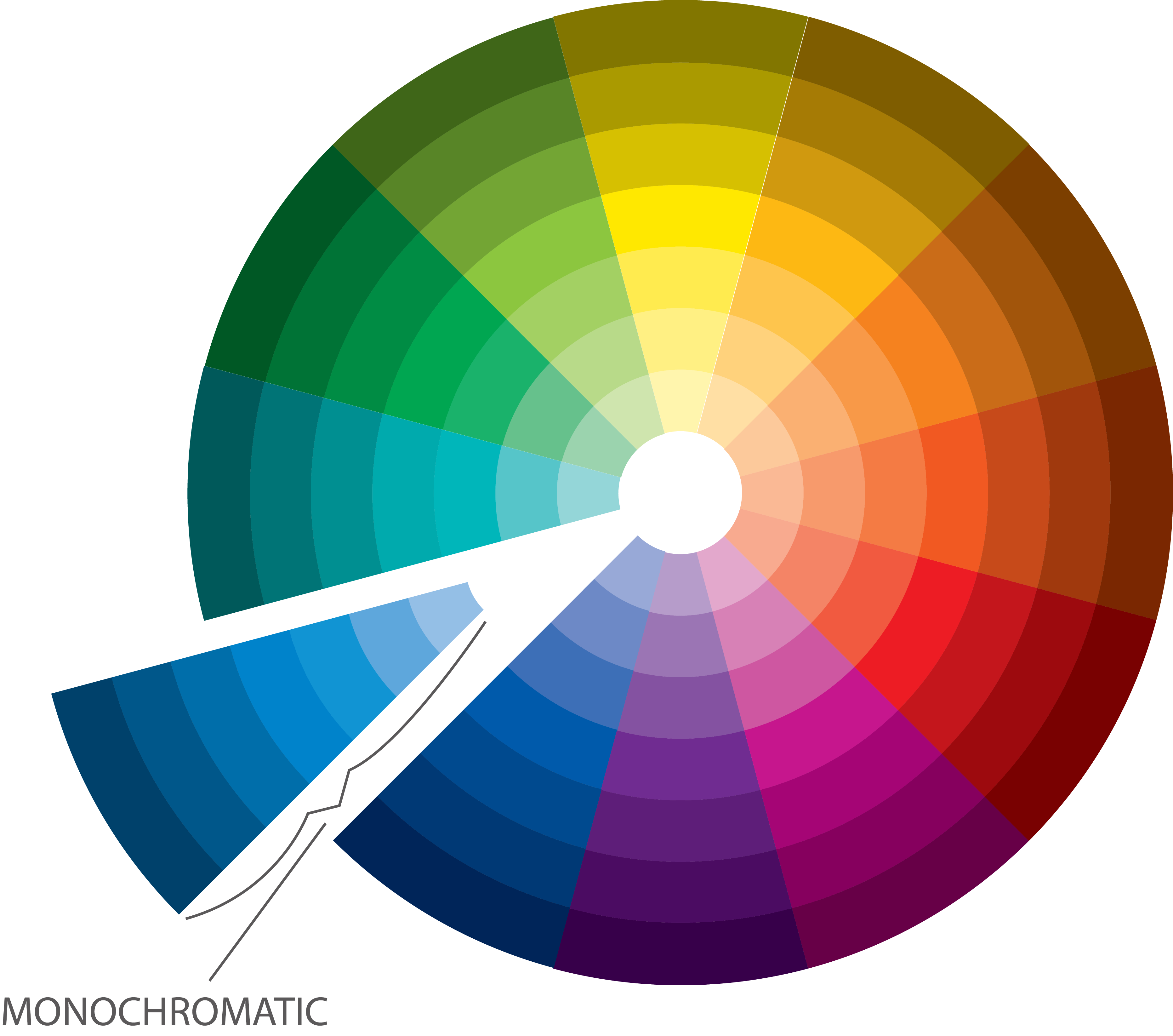
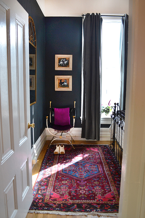
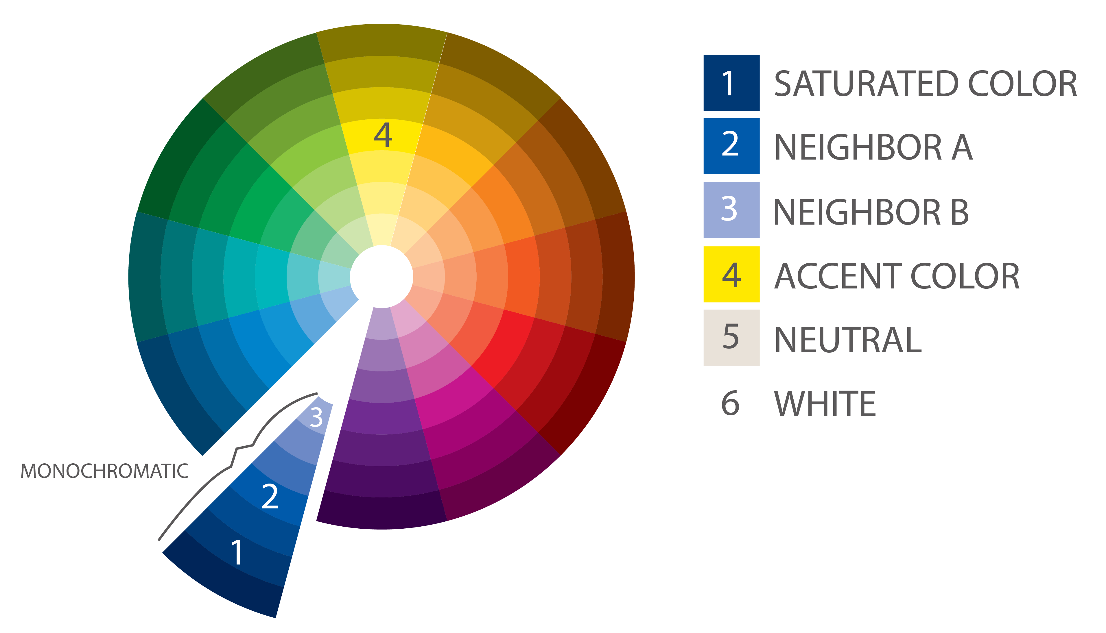
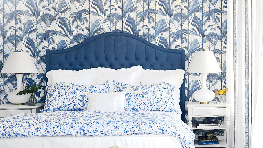
A monochromatic color scheme is a little different than the first two in that you are using one wedge of the color wheel which contains various shades of a single color. This is where I recommend jumping from a five color palette to a six color palette (2 neighbor colors instead of 1) because you will need the variety. Neighbor colors should be taken from the same wedge as your saturated color. There is no hard rule for the accent color you choose however I would advise using something from the opposite side of the wheel. Or, if your entire palette is made up of cool colors, choose a warm accent color (and vice versa) to balance things out. You can see that the accent color in the below room plays a small but significant role. It just wouldn’t be the same without those little yellow flowers!
A monochromatic palette can create a modern, peaceful, elegant and of course harmonious interior. In some ways it is an easy palette to work with; at the same time getting it “just right” takes some thought.
For the color schemes discussed here and more try these articles from FreshHome.com, BallardDesigns.com, HeyThereHome.com, VisualHunt.com or SchoolOfDecorating.com.
Selecting a color palette is one of the most impactful decisions you will make when planning your home decor. No pressure, right? So, where to begin? Break this looming question down by following a few basic rules:
- Start with five or six colors
- Use color theory to guide your choices
Five or Six Colors
It’s essential to achieve a balance between using one color for your entire home interior, and using different colors in every room. You will tire of both of these extremes quickly. So where do you draw the line? The best bet is to use a palette of five to six colors* and stick with them throughout. I am not only referring to paint, but to furniture, artwork and other interior elements. If the main elements of your decor come from a palette of five or six a majority of the time, you will achieve a natural flow of color throughout your home, where the rooms merge nicely without being too uniform or even worse, completely unrelated.
So, you will want to pick...
1 saturated color
1 or 2 neighbors to your saturated color (more on this below)
1 accent color
1 white**
1 neutral***
* HeyThereHome.com and SchoolOfDecorating.com both discuss using a 5 color palette.
** There are many whites out there! Check out this article by ABeautifulMess.com for advice on picking the right one!
*** Neutrals do not have to be tan or grey...you can also use black, midnight blue etc. Here’s a great article by Live Colorful to give you some ideas.
Use Color Theory to Guide Your Choices
Combining color can be a tricky business. Just because you love two colors doesn’t mean they will do well in a room together. Knowing just a little bit about Color Theory can go a long way. To achieve a harmonious combination try one of these three color schemes: 1. COMPLEMENTARY COLOR SCHEME
Opposites attract, right? Well, a complementary color scheme brings this idea into full view. Complementary colors are those that are opposite one another on the color wheel, as the blue-green and red-orange are above. A complementary color palette can be lively, fresh, decadent or soothing depending on the saturation of the colors you choose, and will always be pleasing to the eye.
Use the five color palette rule with a complementary color scheme and choose a shade of your saturated color as the “neighbor”. Here’s a great example:
(Image Courtesty of architectureartdesigns.com)
2. ANALOGOUS COLOR SCHEME
An analogous color palette is another way to create a harmonious interior. Analogous colors are those that are next to one another on the color wheel. Depending on the detail in your color wheel, you will generally want to choose 3 or 4 colors that are adjacent to one another. Analogous color schemes, often found in nature, can create a calm, interesting and/or playful space. Here is an excellent example of a room with an analogous color scheme along with a possible accompanying five color palette.
(Image courtesy of DesignSponge.com)
With an analogous color scheme the “neighbor” color should be a shade of your saturated color or a color that is in the wedge directly “next door”.Notice in the above palette that we skip the purple colors that fall within our four adjacent wedges of the wheel. That is perfectly OK. If you are not a purple fan like me, you can exclude it from your decor altogether. If you do like purple you can throw in a few small accents here or there. With an analogous color scheme you can go either way as long as you stick to your palette a majority of the time.
3. MONOCHROMATIC COLOR SCHEME
A monochromatic color scheme is a little different than the first two in that you are using one wedge of the color wheel which contains various shades of a single color. This is where I recommend jumping from a five color palette to a six color palette (2 neighbor colors instead of 1) because you will need the variety. Neighbor colors should be taken from the same wedge as your saturated color. There is no hard rule for the accent color you choose however I would advise using something from the opposite side of the wheel. Or, if your entire palette is made up of cool colors, choose a warm accent color (and vice versa) to balance things out. You can see that the accent color in the below room plays a small but significant role. It just wouldn’t be the same without those little yellow flowers!
A monochromatic palette can create a modern, peaceful, elegant and of course harmonious interior. In some ways it is an easy palette to work with; at the same time getting it “just right” takes some thought.
(Image courtesy of CoastalLiving.com)
Though above I have shown you an individual room treatment for each color scheme, I am not suggesting you repeat the same usage throughout your entire home. In fact, quite the contrary! Using your palette creatively is key...a key which I will unlock in my next blog!For the color schemes discussed here and more try these articles from FreshHome.com, BallardDesigns.com, HeyThereHome.com, VisualHunt.com or SchoolOfDecorating.com.
To comment on this post please visit my blog on 