Mix and Match Artwork to Create a Masterpiece
March 21, 2018
Mixing and matching artwork is almost a requirement these days. Pairing pieces with different mediums, styles, colors and/or frames will never go out of style because the combination possibilities are infinite. Just when you think you’ve seen it all you’ll inevitably run across another blog, pin or magazine article that contains an art combination that will surprise and delight you. So, if you have some random pieces of art and you’re unsure if they can go together, it’s more than likely that, with a little finesse, they can.
There aren’t many big “Don’ts” when mixing artwork, in fact sky’s the limit if done right. The key is doing it right and honestly sometimes “sky’s the limit” is more daunting than helpful. Projects without constraints can be the most difficult to complete because when the possibilities are endless, it is all too easy to start down one road, make a u-turn, head down another and so forth until you are lost.
I’ve created a rule - a constraint - to help you avoid this dilemma. It is based on the premise that the best combinations unite pieces of art that contrast and have continuity. Let’s call it the CC rule. To apply the CC rule when mixing and matching art, consider the size of your pieces, the color, scale and style of the subject matter, and the color and style of your frames for starters. Which of these features would you like to keep continuous between each piece and which would you like to contrast? You don’t have to address everything, but focusing on a few of these characteristics will help guide a thoughtful gallery. Here are a few examples...
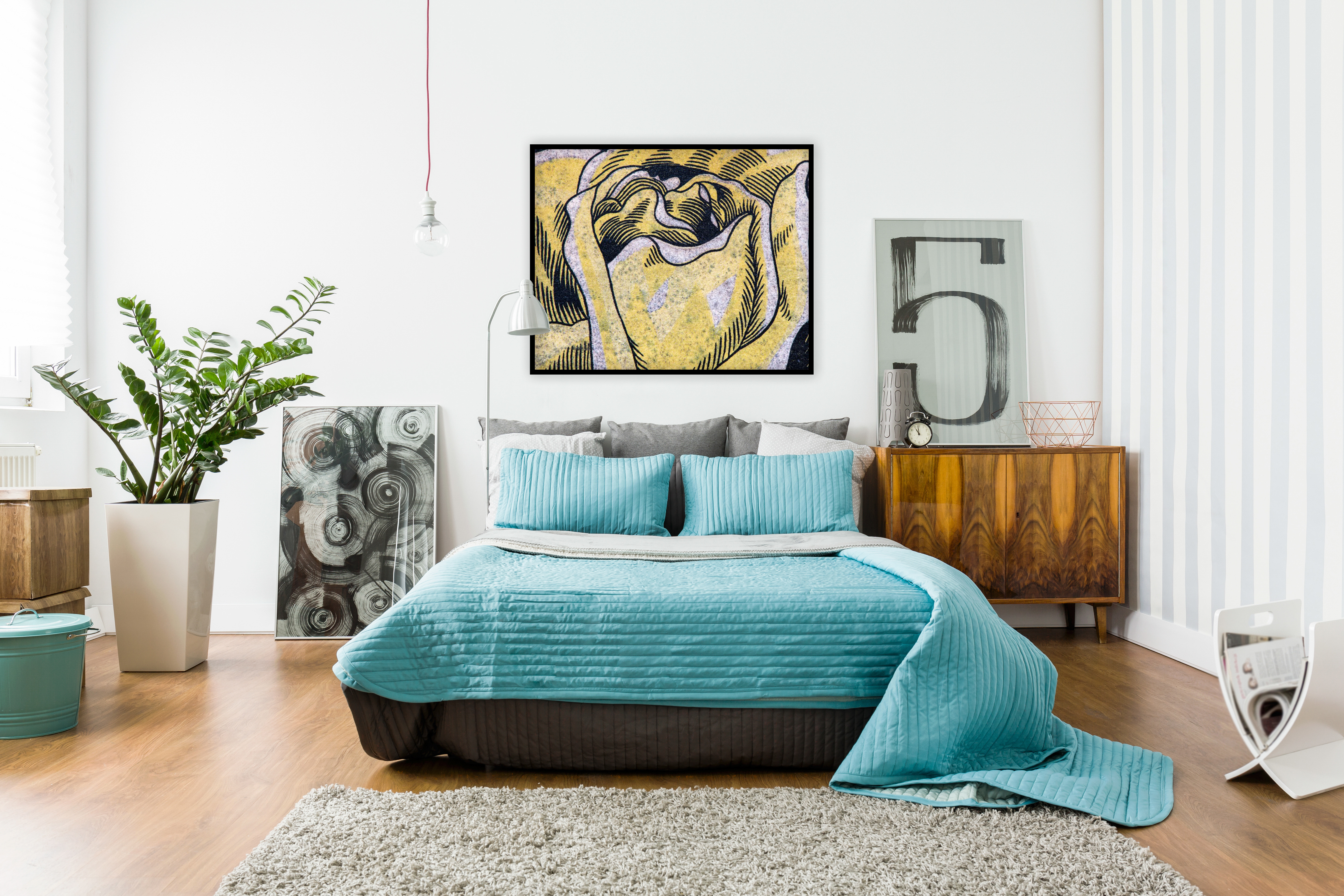
The room image above (with the blue bed) displays art according to the CC rule following this equation:
-Contrast: the scale and complexity of the subject matter varies between each piece
-Continuity: each piece is united by the color black and all are similar in size
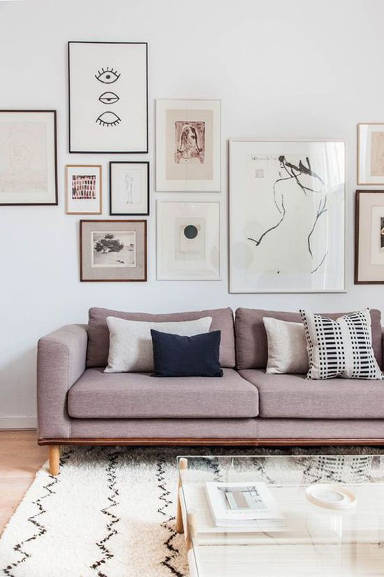
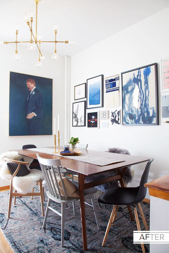
The two rooms below use the same criteria while following our rule:
-Contrast: the size of each pieces is different as is the frame and scale of the subject matter
-Continuity: on the left, soft hues and black are used throughout to unite the whole, and on the right, a strong blue presence ties the gallery together.
http://www.designlovefest.com/
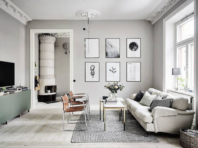
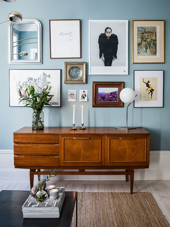
This next room takes a different approach leaning toward uniformity, but look closely, it still abides by our rule:
-Contrast: the scale and style of the subject matter varies
-Continuity: the frames, sizes and colors (or lack thereof) are uniform
Now, you may see the next room and think to yourself, “I see contrast but no continuity...and it looks great!” I agree. This is one of my favorite groupings. However, we are only looking at one wall of the room and that is different than looking at the whole. If we could zoom out to see the whole room what do you think would look better on the opposing wall: something completely different from each of these already unique pieces, or artwork with one or two features that connect it with this grouping? That, my friend, is a topic for another blog.
To comment on this post, please visit my blog on
