The Illusion of Color
August 20, 2014
What if the color of your crayon isn’t really the color you think it is? A couple of weeks ago we got you thinking about colors and what works and what doesn’t for your home. Here’s another challenge in the world of color: The color of your crayon may not look the same on the wall as it does in the box or on the color swatch from the paint store. Depending on what it’s paired with, or as the light and shadows change throughout the day, your favorite color can change dramatically. If your thinking of repainting a room, I strongly recommend painting a large section of a wall and look at it on a rainy day, bright day, at night, with lamps on, curtains open and closed and any other situation you can think of to make sure you like it at all times.
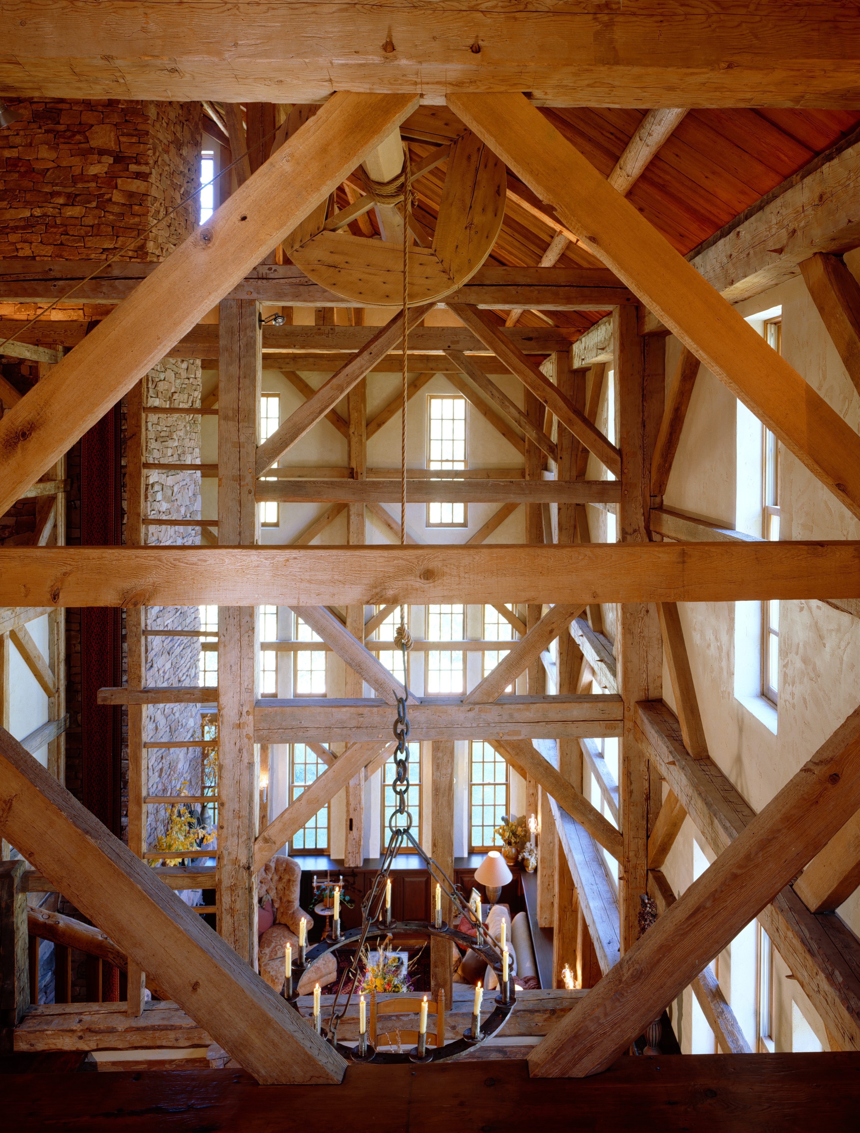
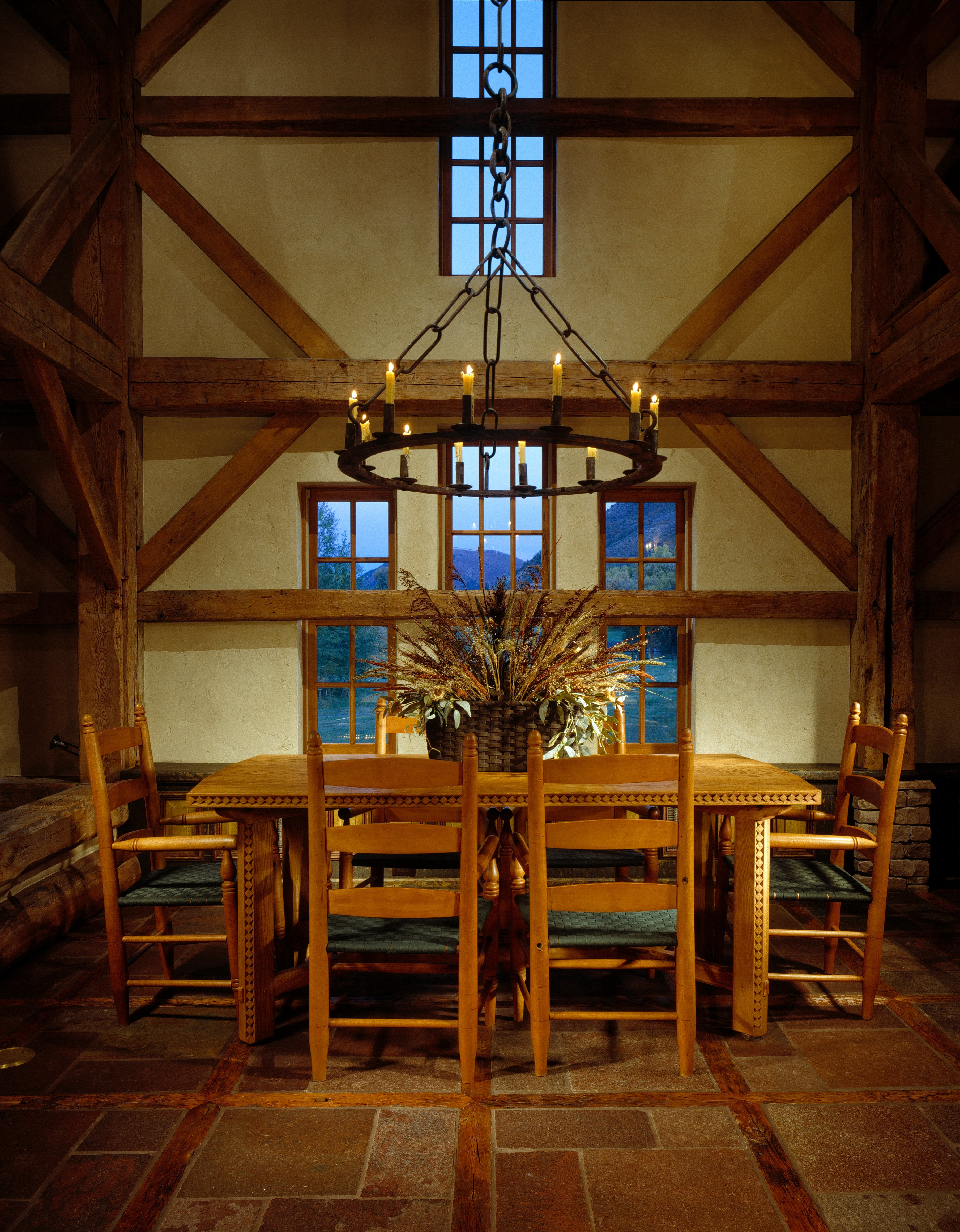
My husband and I restored a barn built in 1800 and we spent weeks looking at colors before we selected the color to be added into the plaster for the walls to complement the antique barn timbers in our home. I can tell you that the color we ended up with was dramatically different from what I originally thought I wanted. I thought I wanted a yellowy/ocher color and ended up with an ivory color. Even if you’re picking a fairly light color, it can turn pink in the evening or get muddy looking or emit a completely different color that you’re not expecting. Selecting a color isn’t just a weekend project, it takes some time and patience, but it’s worth it when it’s right. I haven’t regretted or gotten tired of the color we selected. It’s the perfect complement for the restored structure.
As for art and framing art, the same dilemma applies, especially when you matte and frame a piece of art. A white or light matte is safer for keeping the colors true in your piece. Some people like a matte that accents another color in the room. If it’s on the light side, it can work, but the darker the matte the more color variation can occur in your original piece and it often doesn’t serve the artwork well. The artist or photographer gave a lot of thought to the colors used and it’s best to keep them true. The art is really the accent in the room, not the matte. A black matte and frame can be very dramatic and sometimes it really works, but it will definitely change the look of the colors in your original work.
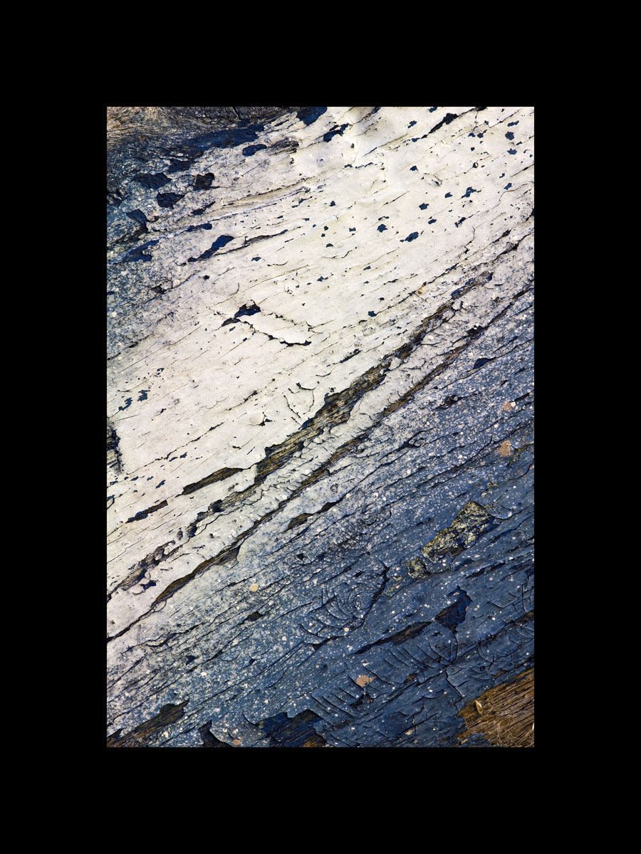
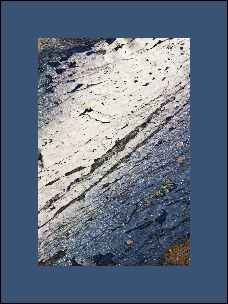
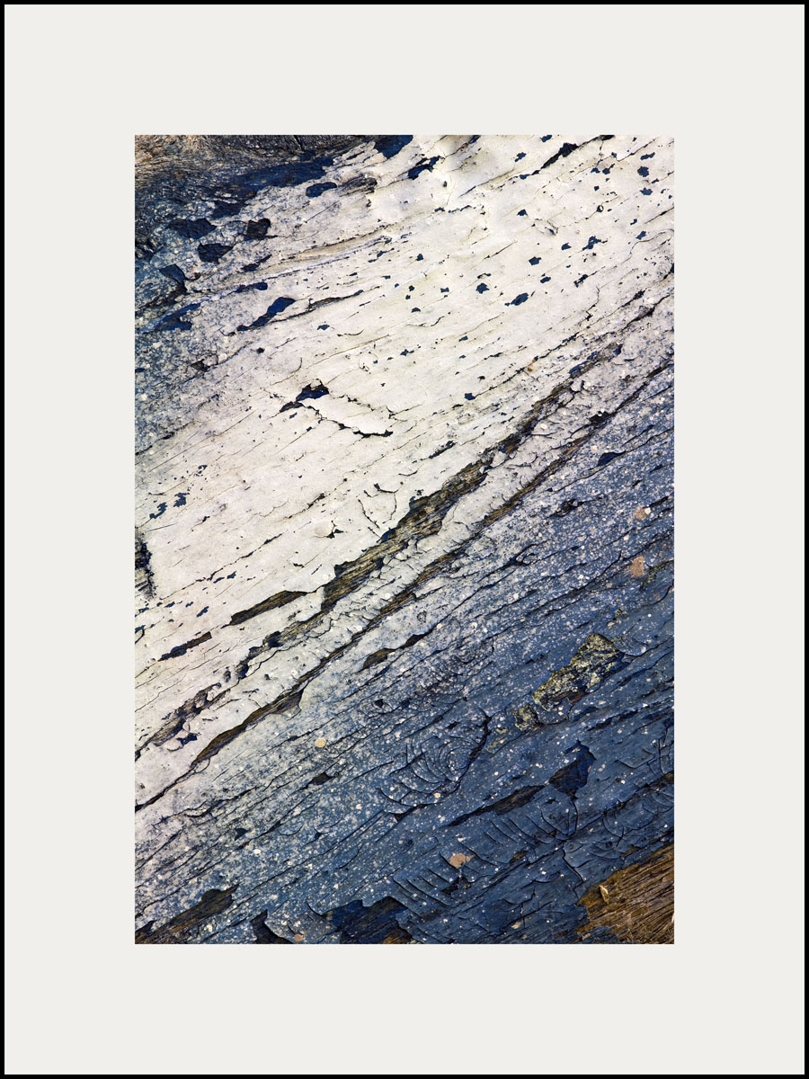
The use of color really is fun and we’ll explore more about it, but be aware of the subtly and illusion of color as you begin to select what’s right for you. Here is an example of one of my pieces of abstract photography, Hang Ten, with different colored mattes. Which do you like the best? To comment on this post please visit my blog on
My husband and I restored a barn built in 1800 and we spent weeks looking at colors before we selected the color to be added into the plaster for the walls to complement the antique barn timbers in our home. I can tell you that the color we ended up with was dramatically different from what I originally thought I wanted. I thought I wanted a yellowy/ocher color and ended up with an ivory color. Even if you’re picking a fairly light color, it can turn pink in the evening or get muddy looking or emit a completely different color that you’re not expecting. Selecting a color isn’t just a weekend project, it takes some time and patience, but it’s worth it when it’s right. I haven’t regretted or gotten tired of the color we selected. It’s the perfect complement for the restored structure.
As for art and framing art, the same dilemma applies, especially when you matte and frame a piece of art. A white or light matte is safer for keeping the colors true in your piece. Some people like a matte that accents another color in the room. If it’s on the light side, it can work, but the darker the matte the more color variation can occur in your original piece and it often doesn’t serve the artwork well. The artist or photographer gave a lot of thought to the colors used and it’s best to keep them true. The art is really the accent in the room, not the matte. A black matte and frame can be very dramatic and sometimes it really works, but it will definitely change the look of the colors in your original work.
The use of color really is fun and we’ll explore more about it, but be aware of the subtly and illusion of color as you begin to select what’s right for you. Here is an example of one of my pieces of abstract photography, Hang Ten, with different colored mattes. Which do you like the best? To comment on this post please visit my blog on