Try Something Unexpected: Color and Décor
April 23, 2015
I am passionate about décor, abstract art and color; specifically a combination of the three. As an abstract photographer I often spend my days literally focused on colors. The play between colors within my viewfinder must be intriguing for me to snap the shot. My images may focus on a 1 or 2” square area, but when blown up 600 times their size, the color-play that initially caught my eye is impactful with sometimes surprising results. It takes time, patience and risk to generate a stirring piece of art.
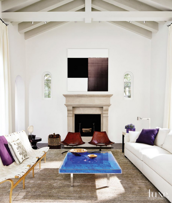
Don't be afraid that you’ll tire of a surprising color you’ve decided to use within your décor. If done right, rooms like the one Martha Angus created remain compelling and a pleasure to be in for years on end.
If you're interested in bringing color-play into your home, you can view my latest abstract art here http://www.lookstudio.net/galleries/latest-images.
To comment on this post please visit my blog on
I think the same methodology holds true for interior décor and composing an intriguing space. If you’ve read any of my previous blogs you probably know that when designing a room I advocate beginning with a neutral interior. Once you’ve created your blank slate try something unexpected.
Purple is not my favorite color. I wouldn’t purposefully decorate with it. However I’m completely fascinated by this room from Luxe Magazine. The colors throughout the room are each unique - the violet throw, the deep purple pillow, the mauve/plum of the abstract art – yet they have a subtle connection within their hue. It's when designer Martha Angus brings in unpredictable colors, the rich burnt umber of the chairs and surprising cobalt blue table, that the room elevates to captivating.
Purple is not my favorite color. I wouldn’t purposefully decorate with it. However I’m completely fascinated by this room from Luxe Magazine. The colors throughout the room are each unique - the violet throw, the deep purple pillow, the mauve/plum of the abstract art – yet they have a subtle connection within their hue. It's when designer Martha Angus brings in unpredictable colors, the rich burnt umber of the chairs and surprising cobalt blue table, that the room elevates to captivating.
Don't be afraid that you’ll tire of a surprising color you’ve decided to use within your décor. If done right, rooms like the one Martha Angus created remain compelling and a pleasure to be in for years on end.
If you're interested in bringing color-play into your home, you can view my latest abstract art here http://www.lookstudio.net/galleries/latest-images.
To comment on this post please visit my blog on