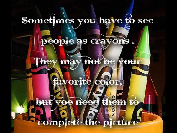
What Color is Your Crayon?—The Psychology of Color
August 8, 2014
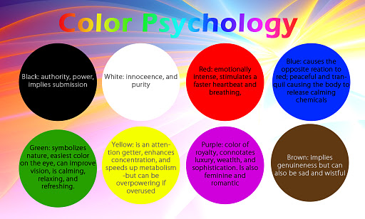
Red’s hot!...or not… A friend came into my studio recently and looked at Still Life and said “red is an angry color”, and I responded, “it’s a stimulating color”. Another friend mentioned that she used to feel sick when she was near someone wearing red! One thing is for sure, red is a powerful color. Incidentally, the friend who thinks red is “angry” loves soothing blue/green colors and he loves the water—no surprise!
Since Look Studio’s inception I’ve produced a lot of colorful abstract art. While doing so, I’ve become more and more aware of the power of color. As I watch customers respond to a color in my abstract photography favorably or not, I realize that the psychology of color is the building block to knowing how to use color in your home and may be influential in buying art. The subject of color whether it’s on your walls or in your abstract art or in a throw pillow has inspired a series of topics that will be helpful in creating the environment you want in your home.
Here are some tips for thinking through color selections:
. What mood are you trying to create?
. What colors make you feel the best?
. What colors work best for your family as a whole?
. What color can you live with day in and day out?
As you begin to think about color, check out what the experts say about color. Here are some quick resources that will help you get started:
www.iiteeeestudents.wordpress.com/tag/sigmund-freud
www.psychology.about.com/od/sensationandperception/a/colorpsych.htm
www.infoplease.com/spot/colors1.html
Let’s look at each of the tips for colors:
Mood – are you going for a fun/whimsical look, sophisticated look, soothing look or an organic look? You’re not just painting the wall or your house, you’re inviting people into your home and you want to create a feeling that represents who you are.
Feeling – Identify colors you like and the feelings they evoke. My favorite color is green, but I don’t want a green house or necessarily a green wall. When I was in my first apartment, I painted my furniture “dusty” blue. For some reason I thought that would look good. Later I discovered that blue depresses me and I can’t be around a lot of blue. I wasted time and energy on a color that didn’t work for me. Warmer colors make me feel good and that’s what I gravitate toward in my home.
Family – If you like pink and your partner likes brown, you’ve got some work to do. You may compromise on a taupe or beige with a hint of pink in it. Colors in the common areas need to work for the whole family. Your daughter’s room can be painted the color of “My Little Princess Pony”, but not the entire house. Actually, it can, if you love the color that much.
Lasting – Color on walls and accessories or even art is a quick and fairly easy way to change the look of your home. But it takes time and money so you want to like it for awhile. Merchandisers capitalize on trendy colors but they also change them by the day, week or month. It’s great to be aware of the trends, but make sure the color really resonates with you or you may be tired of it by next year.
Let me know your color successes and your color regrets. What’s worked for you? How compelled do you feel to use trendy colors? We’ll talk about more ideas as you narrow down your color ideas. Play with a color chart with the whole family and decide the color of your crayon. To comment on this post please visit my blog on