10 Key Home Decorating Tips: #5 Color transition
May 28, 2019
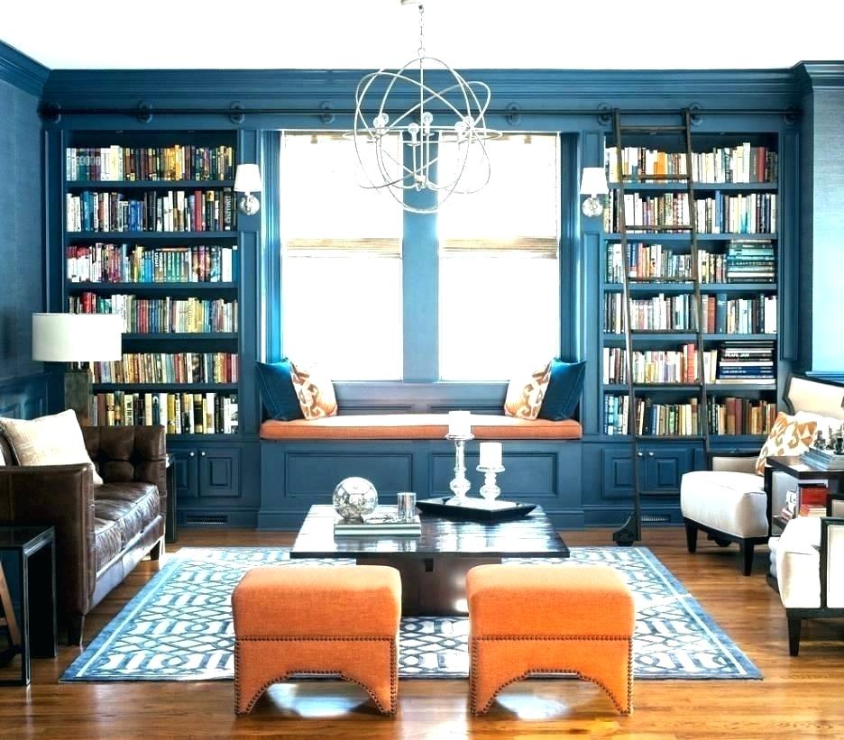
If you’ve read my last two blogs, the first about atmosphere, style and inspiration and the second about color, you have by now laid the groundwork for creating an aesthetic transition of color throughout your home. I have found that a bit of variety from room to room produces the best results. As an example, take a look at the picture below. Though this is a beautiful room, replicating navy walls and orange accents throughout your entire home may quickly cause decor fatigue. There is a different way.
 (Image from CountryLiving.com)
To get more specific, let’s say the above “blue room” is your living room and from there you can see into the kitchen. Your goal of creating a lively kitchen requires something different - different yet cohesive. I would recommend using the white from the living room carpet or chairs as the kitchen wall and trim color, bright orange as the primary accent (barstools or dishes or fixtures) and navy as the secondary accents (utensils or glassware or within a patterned backsplash). The palette neutral often transitions well on secondary furniture or flooring. A color scheme something like this room but with navy instead of aqua blue accents works very well:
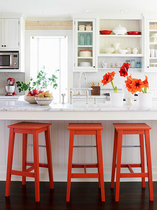 (Image from bhg.com)
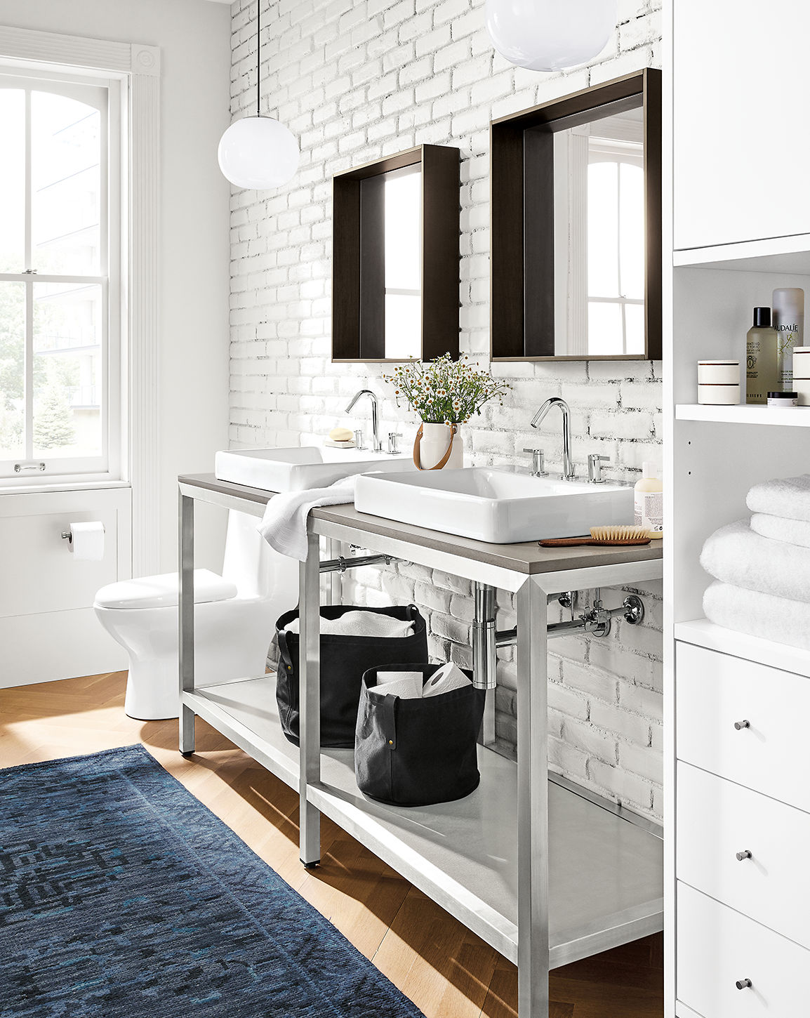
If, adjacent to the kitchen, you can see into a hallway or wash closet, revisit your atmosphere choice for those areas and continue the trail of breadcrumbs. To create a clean and peaceful ambience focus on the white or neutral colors from your palette, nix or minimize the bright pops, and accent with your saturated color and/or it’s neighbor.
(Image from Room & Board)
Each of these rooms tie together nicely with color; do keep in mind the added task of keeping your style streamlined, which these particular images do not do. For more information on style visit my December blog. For one last extremely helpful tip on color stay tuned for my next blog that discusses the Rule of 60-30-10!
To comment on this post, please visit my blog on
(Image from CountryLiving.com)Review your palette
Let’s map out how you might take the colors in this room and use them to connect one room to another. Following the formula discussed in 10 Key Home Decorating Tips: #4 COLOR here’s a likely palette for this “blue room”:- 1 saturated color: navy
- 1 neighbor to your saturated color: one shade up from navy
- 1 accent color: orange
- 1 white: alabaster white
- 1 neutral: chocolate
Review your atmosphere choices
With this palette in mind we next review our atmosphere choices for each room. Let’s say you’d like a classic/regal feeling living room, a kitchen that is lively and welcoming and bed/baths that are clean and peaceful. Pick your colors accordingly. Using our example palette above I would select...- Living room: emphasis on navy
- Kitchen: emphasis on white with orange accents
- Bed/baths: emphasis on white and neutral
Get the lay of the land and leave a trail of breadcrumbs
Now stand in what you think to be the most important room of your house - let’s say it’s the living room. From that location look around to see what adjacent rooms or hallways are in your line of vision. Perhaps you can see into a hallway or get a partial view of the kitchen. Instead of repeating your living room palette in all of those areas, deviate a bit as necessary based on the atmosphere you want to achieve in those locations.To get more specific, let’s say the above “blue room” is your living room and from there you can see into the kitchen. Your goal of creating a lively kitchen requires something different - different yet cohesive. I would recommend using the white from the living room carpet or chairs as the kitchen wall and trim color, bright orange as the primary accent (barstools or dishes or fixtures) and navy as the secondary accents (utensils or glassware or within a patterned backsplash). The palette neutral often transitions well on secondary furniture or flooring. A color scheme something like this room but with navy instead of aqua blue accents works very well:
(Image from bhg.com)
If, adjacent to the kitchen, you can see into a hallway or wash closet, revisit your atmosphere choice for those areas and continue the trail of breadcrumbs. To create a clean and peaceful ambience focus on the white or neutral colors from your palette, nix or minimize the bright pops, and accent with your saturated color and/or it’s neighbor.
(Image from Room & Board)
Each of these rooms tie together nicely with color; do keep in mind the added task of keeping your style streamlined, which these particular images do not do. For more information on style visit my December blog. For one last extremely helpful tip on color stay tuned for my next blog that discusses the Rule of 60-30-10!
To comment on this post, please visit my blog on