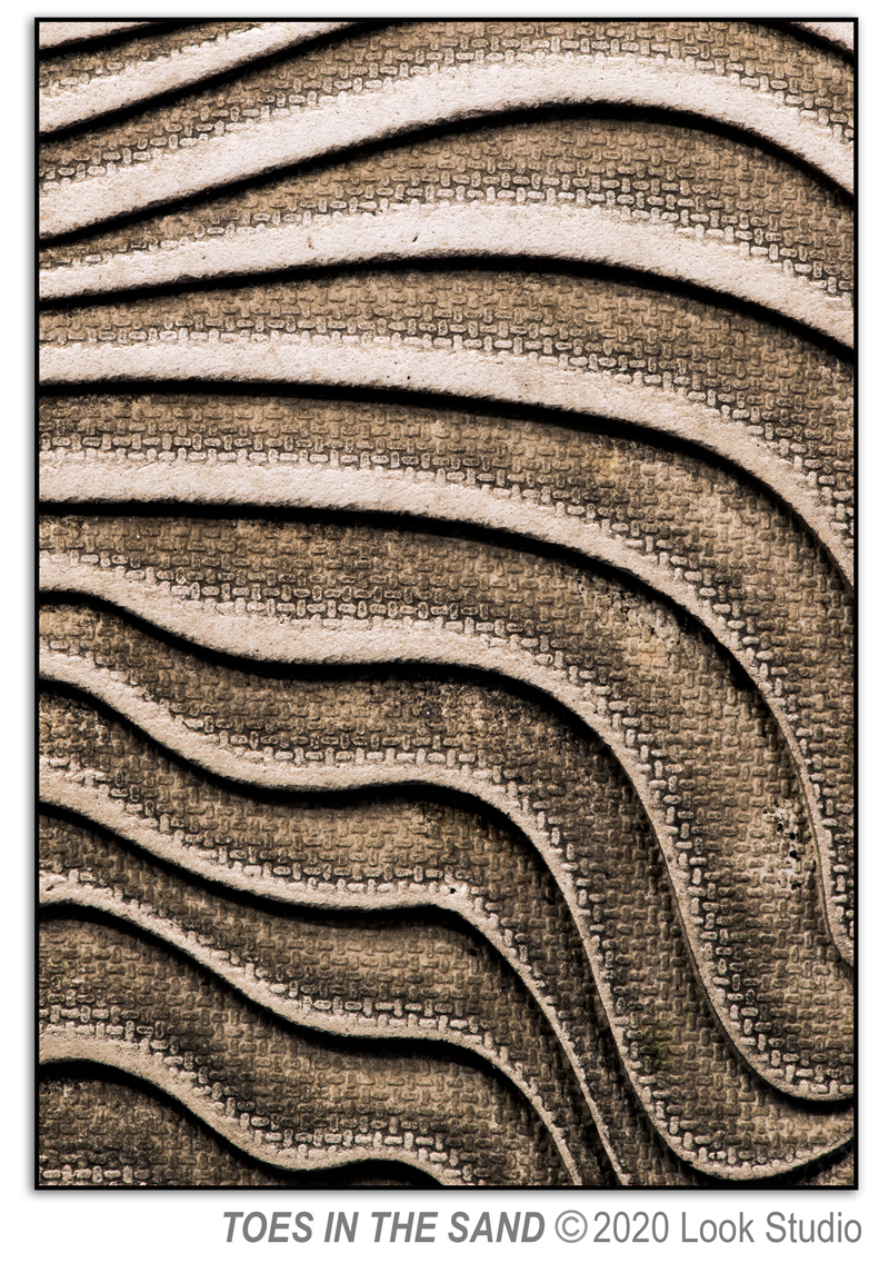
Toes in the Sand
March 26, 2021
 Like many people I am fascinated with watching the waves in the ocean as they come racing toward the shore and then quickly retreat into the shades of blue that get deeper as the ocean reaches the horizon. The motion is mesmerizing. This wind-based tidal movement combined with gravitational pull creates the waves that speak so clearly to the rhythms of life.
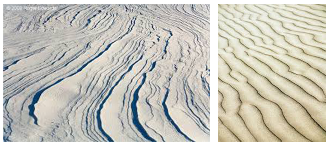
As an extension of influences from the wind, it’s seems natural to be intrigued with the patterns that the wind creates in the sand and snow. These patterns have influenced me since a was a young girl playing in Monahans Sandhills State Park in West Texas.
Patterns in the sand, or snow, represent the self-organizational aspect of classic physics in our world atop planet earth. There is something about these patterns that provide comfort and reinforcement, not to mention beauty, in the marvelous connections that bond us.
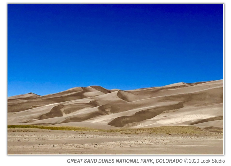
There are many great nature photographers who have captured the sun on the crest of a sand dune in combination with the dramatic shadows in its wake. Ansel Adams captures this beautifully in his work: Sand Dunes, Sunrise, Death Valley National Monument, 1948.
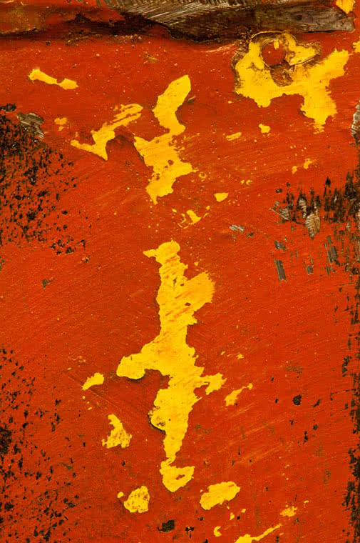
I’m always inspired to capture the beauty of the sand, shadows and sky with my camera, as I did in this image of the Great Sand Dunes National Park in Colorado.
As the days get longer and warmer, I can’t help but long for the sound of the ocean, watching the rhythm of the waves, breathing in the salt air and having my toes in the sand. Even though nature ultimately inspired this image, I had to laugh when I looked at the bottom of my flip flops one day and saw the pattern of waves in the sand. I couldn’t wait to create Toes in the Sand. Thanks to Reef for inspiring the vision of beauty and longing for the ocean.
To comment on this post, please visit my blog on

Change of seasons at the river’s edge
March 19, 2021
The rivers have been beautiful in the Roaring Fork Valley this winter. We’ve had unusual and dramatic ice building up along the sides of the Frying Pan and Roaring Fork rivers that make it look as though only slivers of water are snaking through the riverbed. We've also had exciting ice jams break loose all at once sending huge sheets of ice crashing down the valley.
Each day as I pass over the bridge near my home, I look forward to what the Roaring Fork River has in store for me. As temperatures warm, the clutches of winter are loosening and the water is showing signs that spring is around the corner. River’s Edge, one of my new macro abstract photographs, is inspired by this transition of seasons.
.jpg)
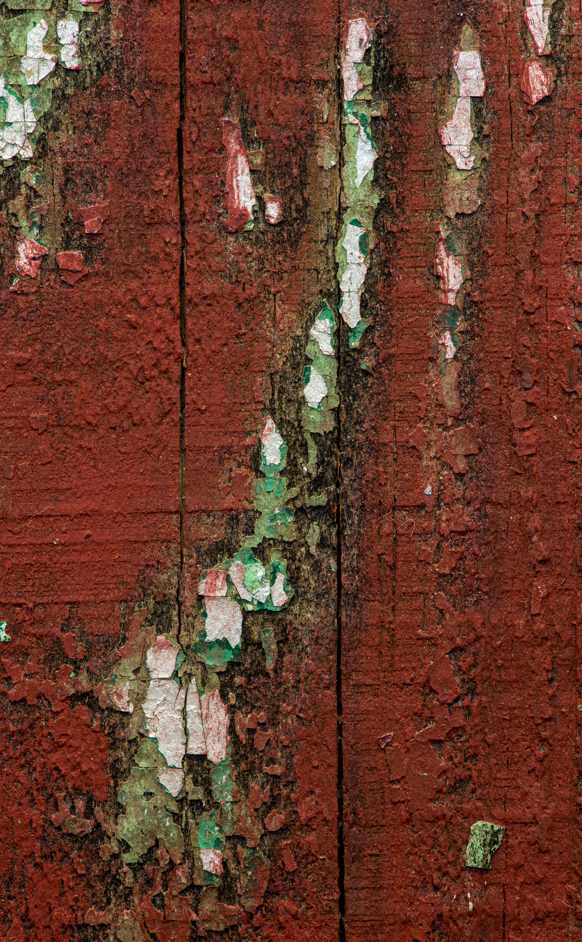
Metal is fascinating to photograph. If the light is flat, it can look calm and soothing like Sweetwater Grass.
Bright light, on the other hand, can bring out colors in metal that surprise you as they did with Titania’s Light.
I began the year photographing metal fragments and always enjoy the discovery process. Please take a look at Sacred Ground and The Deep End on my website for more perspectives on metal.
I hope you enjoy the coming of spring and all the beauty that accompanies the change of seasons in our valley.
To comment on this post, please visit my blog on
Creating a Path to Humanity
August 27, 2020
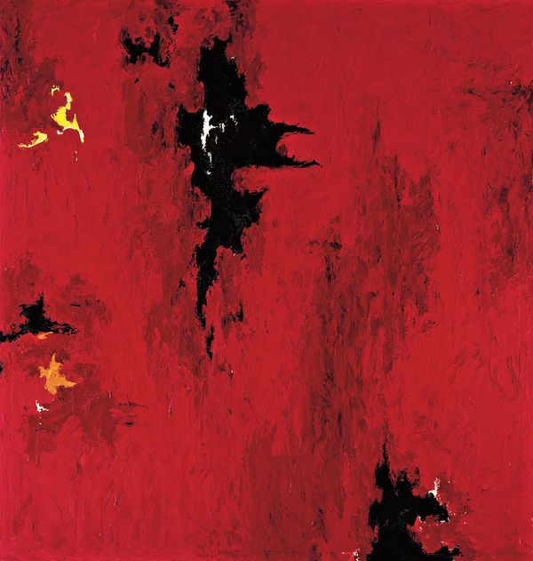
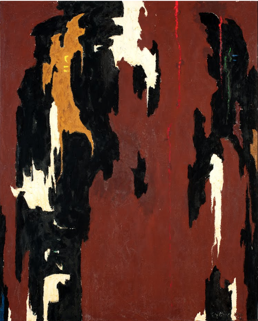
Clyfford Still is one of my inspiration artists. Still is an American Abstract Expressionist and contemporary of Jackson Pollock and Mark Rothko. Although influential among contemporary artists during his time, Still is not well known to many of us because of the choices he made during his art career. Denver, Colorado is very fortunate to have the Clyfford Still Museum dedicated to his work. Still’s art, the architecture of the museum and his story are worth seeing.
At summer’s start the Art Base had a virtual showing of Lifeline: Clyfford Still, a film by Dennis Scholl about Still’s life. Learning about his experience and choices while revisiting his art captured my heart once again, and reminded me of the power in finding our way through art.
The roots of Expressionism started in Germany between 1919 and 1929, and was recognized in the United States in the post-World War II era of the 1940’s. While watching the film it struck me that those difficult years in world history are similar to the exceptionally tough times we’re currently experiencing. And, like a pressure valve, there must be a release. Expressionism exploded on the art scene as the world adjusted to the hardships and atrocities that had occurred. Artists had to find a way to make sense of it all and literal representation on the canvas, or even the blurred and muted colors of Impressionism, were no longer enough as the world became harder to manage and comprehend.
I like to imagine that some of the great artists from this period loosened the lines within their work so we the viewer, and perhaps they themselves, could find individual ways to make sense of life and the world. Leaving a portion of the canvas empty allowed breath, a pause, and hope. Perhaps for them a realistic interpretation of life and the use of painting to replicate life with precision no longer fit. Or maybe they didn’t want to fit into that world. These artists who colored ‘outside the lines’ did what made sense to them despite the classical constraints and expectations of art in popular society. The blurred edges, minimalistic lines and empty canvases that blossomed through Abstract Expressionist’s like Clyfford Still continue to allow each of us to find our interpretation and place in the chaos of life. In this way, art creates a path to our personal humanity.
For me, as the world clamps down its restraints, I find relief through my abstract photography and strive for less information in my images. In undefined space I can envision the reality I wish for humanity. And with this undefined space I can endeavor to create hope, possibility and room for each viewer to do the same. One of my first bold images in 2012 was titled Still Life and inspired by Clyfford Still’s work.
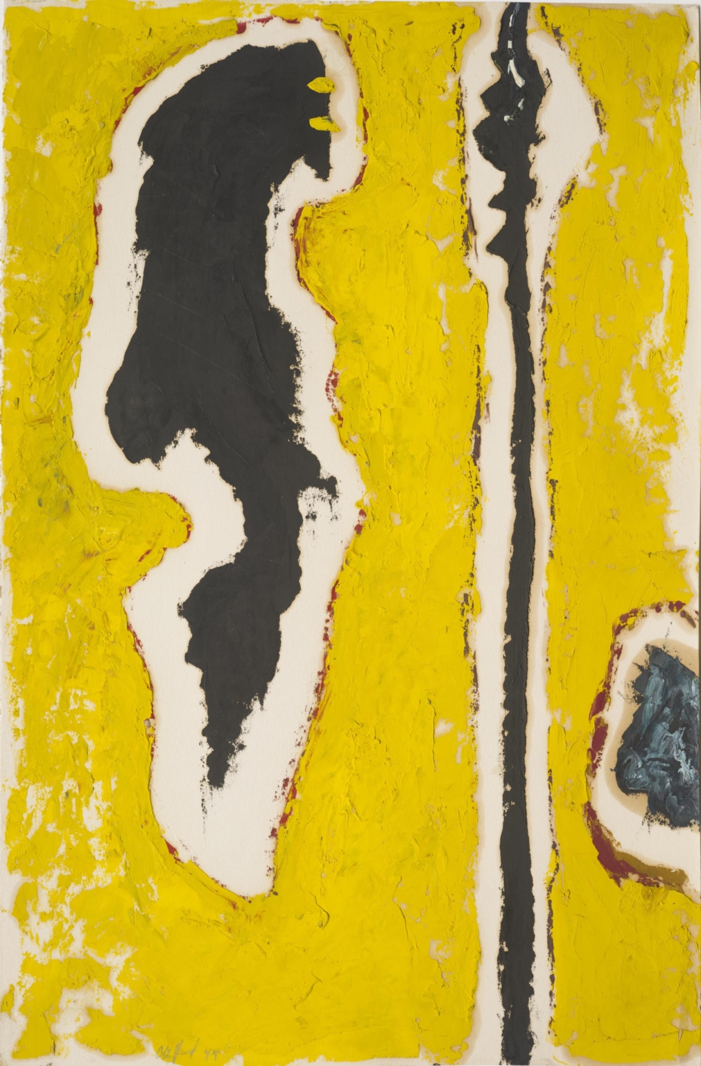
And recently Still’s work has inspired two new images from Look Studio:
Thanks to the master artists who forge outside the boundaries of the mainstream and keep us inspired. Art is a bridge that connects, heals and gives humanity an avenue of resilience and hope. And thank you to the Clyfford Still Museum for making his images available online.
At summer’s start the Art Base had a virtual showing of Lifeline: Clyfford Still, a film by Dennis Scholl about Still’s life. Learning about his experience and choices while revisiting his art captured my heart once again, and reminded me of the power in finding our way through art.
The roots of Expressionism started in Germany between 1919 and 1929, and was recognized in the United States in the post-World War II era of the 1940’s. While watching the film it struck me that those difficult years in world history are similar to the exceptionally tough times we’re currently experiencing. And, like a pressure valve, there must be a release. Expressionism exploded on the art scene as the world adjusted to the hardships and atrocities that had occurred. Artists had to find a way to make sense of it all and literal representation on the canvas, or even the blurred and muted colors of Impressionism, were no longer enough as the world became harder to manage and comprehend.
I like to imagine that some of the great artists from this period loosened the lines within their work so we the viewer, and perhaps they themselves, could find individual ways to make sense of life and the world. Leaving a portion of the canvas empty allowed breath, a pause, and hope. Perhaps for them a realistic interpretation of life and the use of painting to replicate life with precision no longer fit. Or maybe they didn’t want to fit into that world. These artists who colored ‘outside the lines’ did what made sense to them despite the classical constraints and expectations of art in popular society. The blurred edges, minimalistic lines and empty canvases that blossomed through Abstract Expressionist’s like Clyfford Still continue to allow each of us to find our interpretation and place in the chaos of life. In this way, art creates a path to our personal humanity.
For me, as the world clamps down its restraints, I find relief through my abstract photography and strive for less information in my images. In undefined space I can envision the reality I wish for humanity. And with this undefined space I can endeavor to create hope, possibility and room for each viewer to do the same. One of my first bold images in 2012 was titled Still Life and inspired by Clyfford Still’s work.
(Left: Still Life by Look Studio 2012 | Right: 1947-R-no.1 by Clyfford Still, courtesy of the Clyfford Still Museum)
And recently Still’s work has inspired two new images from Look Studio:
(Left: Revelation by Look Studio2020 | Right: PH-489 by Clyfford Still, courtesy of the Clyfford Still Museum)
(Left: Silver Lining by Look Studio2020 | Right: PH-945 by Clyfford Still, courtesy of the Clyfford Still Museum)
Thanks to the master artists who forge outside the boundaries of the mainstream and keep us inspired. Art is a bridge that connects, heals and gives humanity an avenue of resilience and hope. And thank you to the Clyfford Still Museum for making his images available online.
Unveiled
June 26, 2020
Inspired and enjoying time in the studio! Here’s what’s new:
Oscar Wilde wrote, "Life imitates Art far more than Art imitates Life”, but we draw from life as an inspiration for art. When the world came to a halt this year with the onset of COVID 19, it became a time to evaluate what’s important—health, friends/family, laughter, food, and for me, art. I’ve learned, through the years, that difficult times can lead to inspiration, so I waited. Here’s what came through my lens depicting the ebb and flow of life.
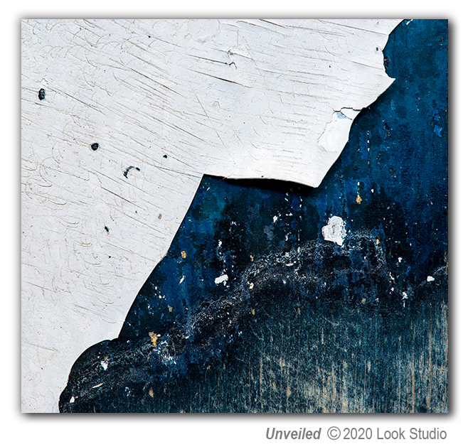
A single piece of art can inspire different thoughts and feelings in different people. I imagine one person might look at Unveiled and think of a moonlit Arctic Ocean while another might appreciate it as a non-object, something abstract and mysterious. I wonder, if I reveal the items I photograph, will it take away that singular experience? I have thought about this a lot and, in the end, don’t think it will. After spending many hours creating Unveiled, even I see it separate and apart from its origination. And people so often ask me for the story behind my art...
Unveiled was born from a humble painted stool; an American antique I found in Texas. I have photographed this piece in the past but recently a new spot caught my eye; a spot smaller than one square inch. There is always more to be discovered in life, but we have to look closely and with a fresh perspective to see it! Once I photographed my new revelation, I moved the stool and the peeling white paint I had just photographed, chipped off. I had to laugh, because Unveiled can never be created again now that the paint chip is gone. It reminded me of how fleeting our experiences may be and how important it is to enjoy every moment!
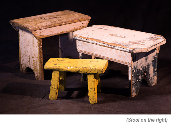
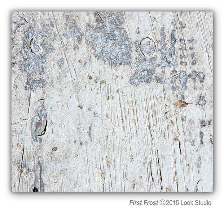
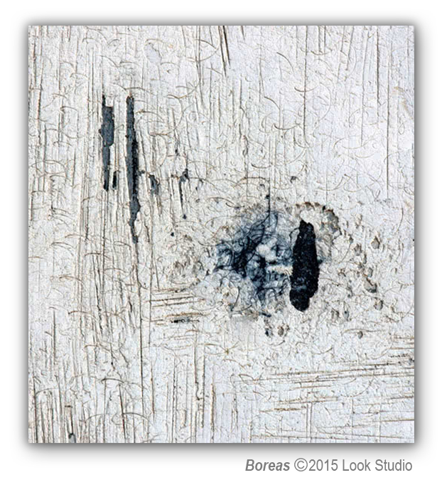
In 2015 I photographed this same stool to create First Frost and Boreas. As you can see, this one modest object has given me much inspiration and produced very different results.
Oscar Wilde wrote, "Life imitates Art far more than Art imitates Life”, but we draw from life as an inspiration for art. When the world came to a halt this year with the onset of COVID 19, it became a time to evaluate what’s important—health, friends/family, laughter, food, and for me, art. I’ve learned, through the years, that difficult times can lead to inspiration, so I waited. Here’s what came through my lens depicting the ebb and flow of life.
A single piece of art can inspire different thoughts and feelings in different people. I imagine one person might look at Unveiled and think of a moonlit Arctic Ocean while another might appreciate it as a non-object, something abstract and mysterious. I wonder, if I reveal the items I photograph, will it take away that singular experience? I have thought about this a lot and, in the end, don’t think it will. After spending many hours creating Unveiled, even I see it separate and apart from its origination. And people so often ask me for the story behind my art...
Unveiled was born from a humble painted stool; an American antique I found in Texas. I have photographed this piece in the past but recently a new spot caught my eye; a spot smaller than one square inch. There is always more to be discovered in life, but we have to look closely and with a fresh perspective to see it! Once I photographed my new revelation, I moved the stool and the peeling white paint I had just photographed, chipped off. I had to laugh, because Unveiled can never be created again now that the paint chip is gone. It reminded me of how fleeting our experiences may be and how important it is to enjoy every moment!
In 2015 I photographed this same stool to create First Frost and Boreas. As you can see, this one modest object has given me much inspiration and produced very different results.
The Art of Giving: A Boy, A Box, A Bouquet
June 18, 2020
The Transformation of Giving into Art
There was a little boy name Colin who loved trucks and games and drawing.
Colin played and played all day long but couldn’t go outside because the world had gone wrong.
He had to be careful, he had to be safe. It wasn’t as fun and he wanted to run.
Colin’s mom wanted him to be happy and was at wits end because Colin wanted no napping.
Mom heard about Art Kits to Go, if you just walk in. The Art Base was handing out boxes for free, what a bargain.
She ventured out, unsure of the new world around and was surprised at what she found.
Behind a mask she saw a smile as the Art Kit to Go from Art Base was handed to her for a trial.
Excited and thrilled she hurried home to Colin to show him so he would no longer groan.
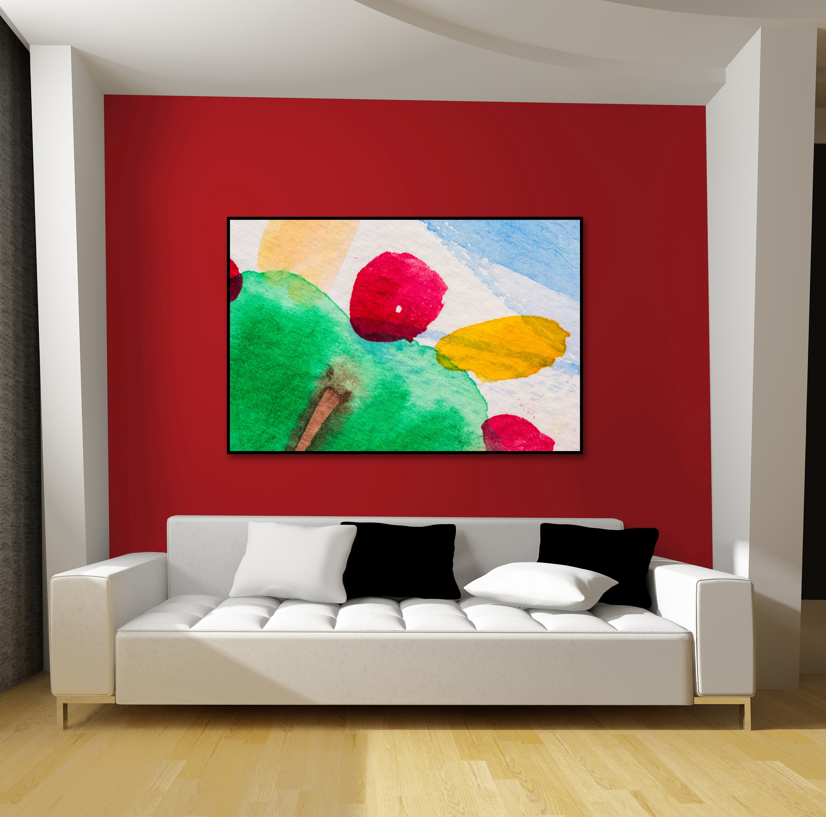
They took the bits and pieces and started laughing and painting. Who knew drawing lines and watercolors were so fun, no debating.
After drawing awhile, he showed his Grandma B so she could smile.
She looked and oohed and aahed and Colin was pleased he had done a good job.

Some time had passed and people still weren’t happy so Grandma B said let’s help some people not be so snappy.
She and Colin took his drawings and made a sleeve that would hold a bouquet of flowers for those who wanted to believe.
It was the first of May and a glorious day to share these bouquets with friends away.
The flowers arrived as a surprise and the “priceless” art they were wrapped in would have to survive.
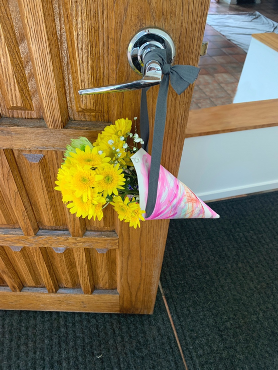
Receiving and believing the Happy May Day gift lifted my spirits and I began to wonder how I could give back to Colin and Grandma B within free limits.
A photo, I thought to capture his creations so he could remember and smile with elation.
To give from the heart is free, to give freely is our right. To warm someone’s heart is a form of art and creates light.