Hotels as Art Galleries
April 26, 2018
In the past, art for hotels was often selected from manufacturing companies that produced art on a large-scale basis. Today interior designers and art consultants are going deeper to leverage the power of art by researching artists and their work to pull together unforgettable collections that create unforgettable experiences. Curating unique artwork not only creates a branded ambience, it prompts guests to explore, discuss and think back upon their stay once it has ended. All of this translates to word-of-mouth advertising, and both repeat and new visits.
Because of my experience with the Westin DIA and now the Ritz Carlton-Vail, and because beautiful and interesting hotels provide a fantastic backdrop for art, I have been exploring those that take art beyond a simple still life in the lobby and into a gallery-like experience. The 21c Museum Hotel, Louisville is one that proves memorable in this regard and is especially intriguing to me because of my long-time interest in historical buildings.
21c is made up of five renovated 19th century tobacco and bourbon warehouse buildings and provides an immersive artistic experience from the moment you look upon the main building. Red penguins and a golden statue of David are hard to ignore, piquing curiosity and inspiring you to step inside.
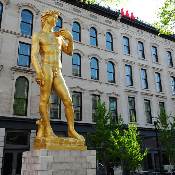
21c Museum Hotel in Louisville | Image Source: HotelScoop
The variety and abundance of contemporary artwork within contrasts nicely with the hotel’s “historical bones"* and legitimizes the word “museum” in its name. There are both permanent and rotating exhibits including portraits, paintings, photography, sculptures, and interactive installations by global artists. As in a museum, guests naturally stop, look, and wonder.
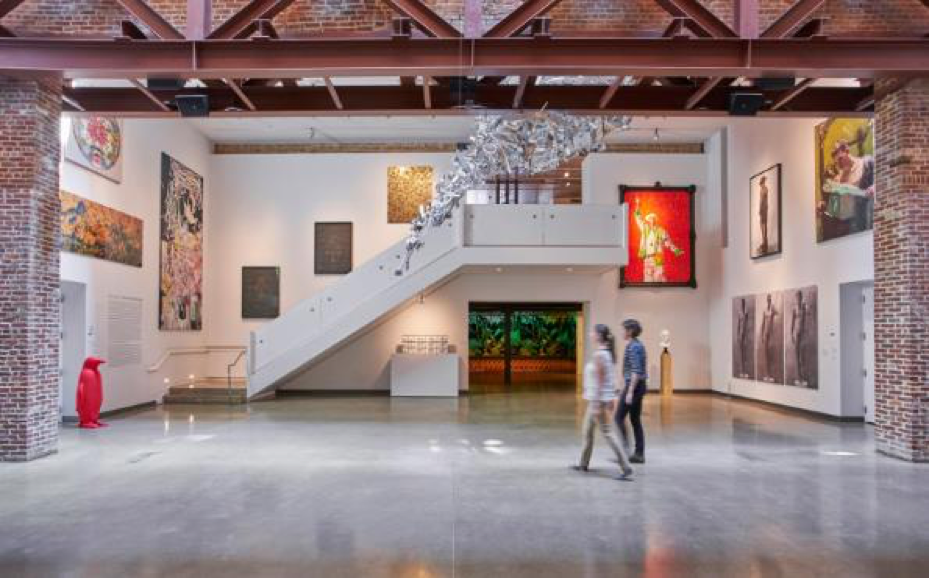
The Red Penguin sculptures can be seen sporadically throughout. This exhibit becomes a friend, something you look for, and eventually a snapshot in your memory that you want to share.
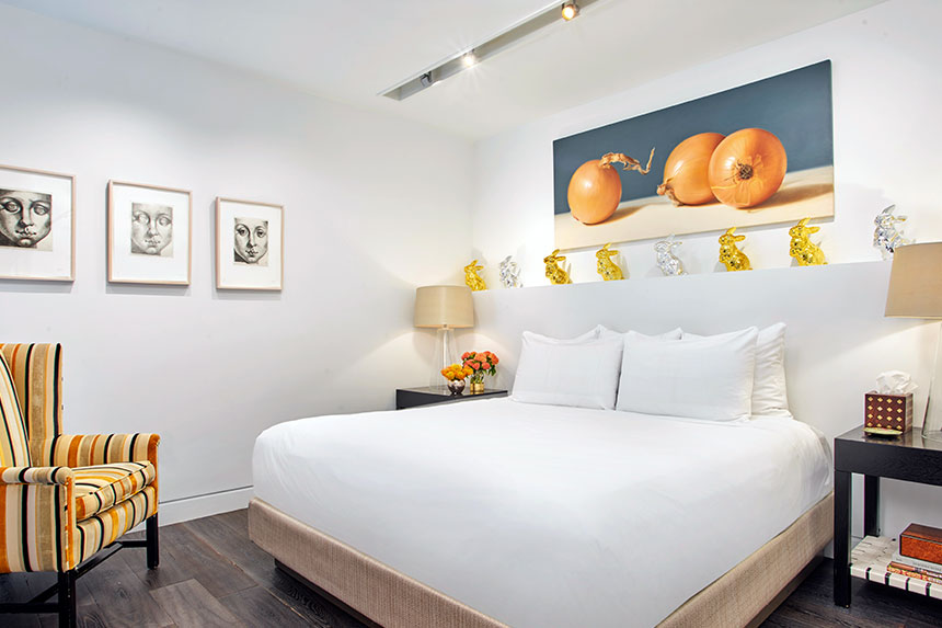
Artwork extends into the restaurant, the gym, the halls, and of course, the guest rooms.
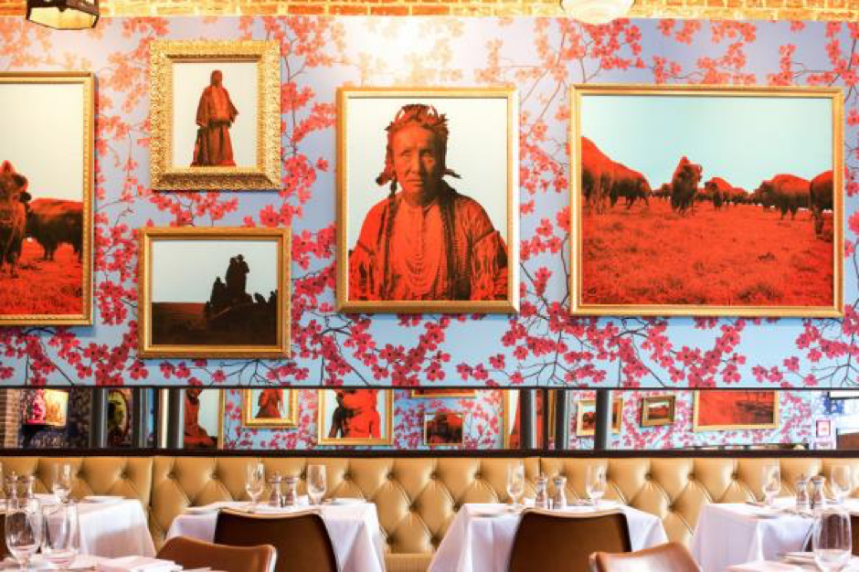
21c’s Restaurant - Proof on Main | Image Source: Official Website
The time, money and effort 21c Museum Hotel, Louisville puts into art selection creates their reputation.
Do you think it pays off?
To comment on this post, please visit my blog on
Do you think it pays off?
To comment on this post, please visit my blog on
* https://www.21cmuseumhotels.com/louisville/
Mix and Match Artwork to Create a Masterpiece
March 21, 2018
Mixing and matching artwork is almost a requirement these days. Pairing pieces with different mediums, styles, colors and/or frames will never go out of style because the combination possibilities are infinite. Just when you think you’ve seen it all you’ll inevitably run across another blog, pin or magazine article that contains an art combination that will surprise and delight you. So, if you have some random pieces of art and you’re unsure if they can go together, it’s more than likely that, with a little finesse, they can.
There aren’t many big “Don’ts” when mixing artwork, in fact sky’s the limit if done right. The key is doing it right and honestly sometimes “sky’s the limit” is more daunting than helpful. Projects without constraints can be the most difficult to complete because when the possibilities are endless, it is all too easy to start down one road, make a u-turn, head down another and so forth until you are lost.
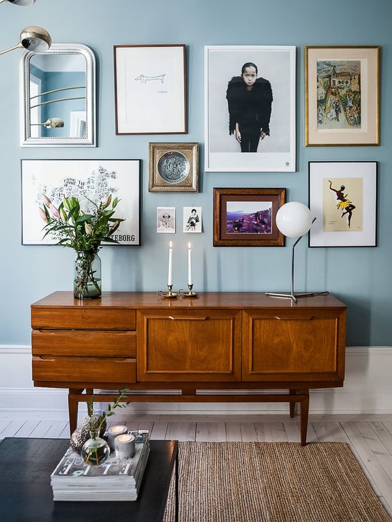
I’ve created a rule - a constraint - to help you avoid this dilemma. It is based on the premise that the best combinations unite pieces of art that contrast and have continuity. Let’s call it the CC rule. To apply the CC rule when mixing and matching art, consider the size of your pieces, the color, scale and style of the subject matter, and the color and style of your frames for starters. Which of these features would you like to keep continuous between each piece and which would you like to contrast? You don’t have to address everything, but focusing on a few of these characteristics will help guide a thoughtful gallery. Here are a few examples...
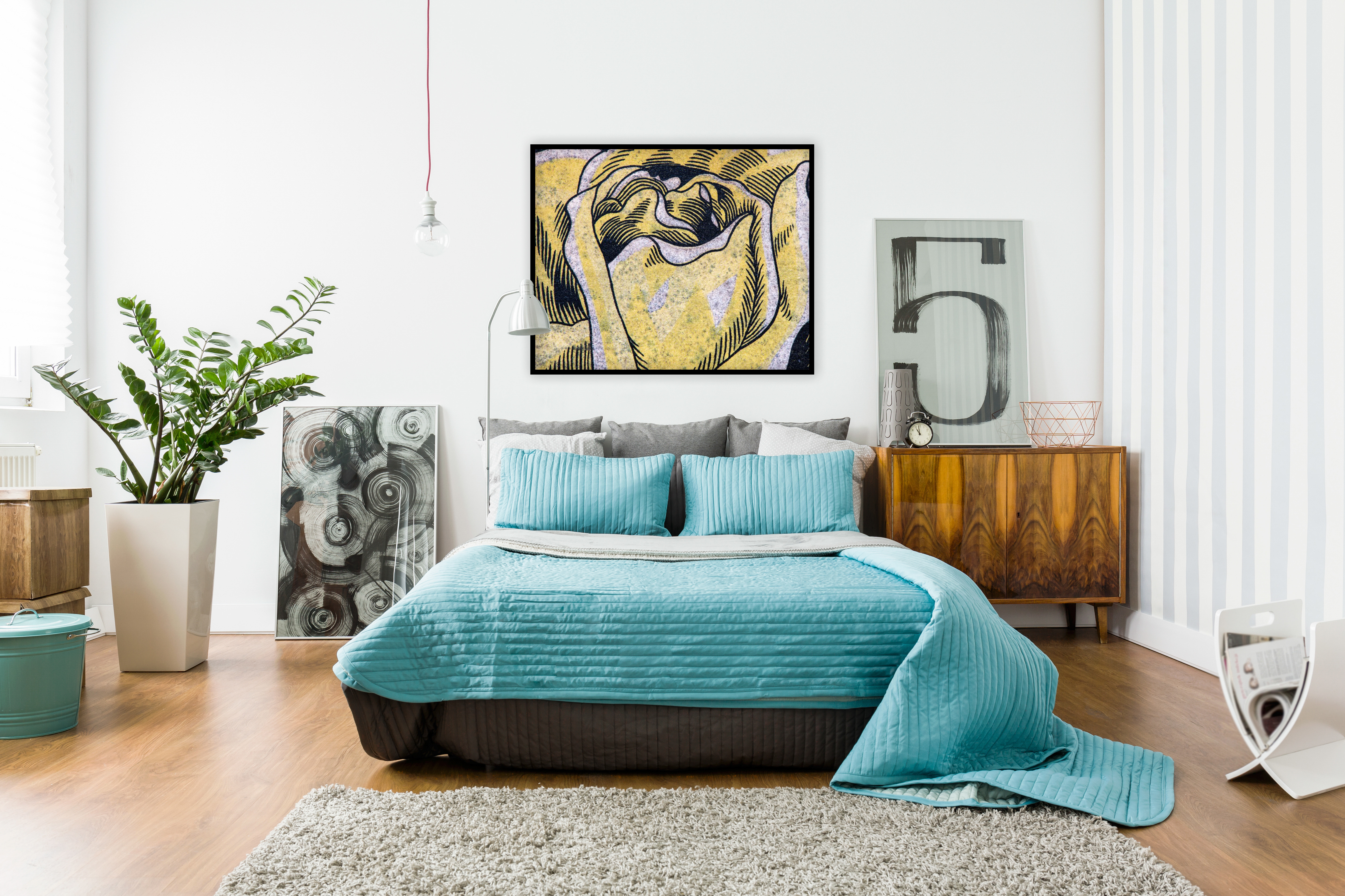
The room image above (with the blue bed) displays art according to the CC rule following this equation:
-Contrast: the scale and complexity of the subject matter varies between each piece
-Continuity: each piece is united by the color black and all are similar in size
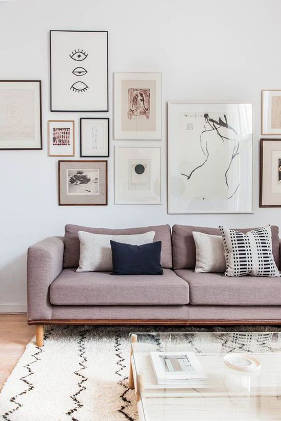
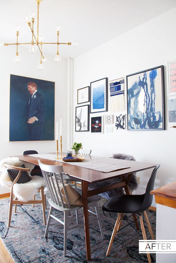
The two rooms below use the same criteria while following our rule:
-Contrast: the size of each pieces is different as is the frame and scale of the subject matter
-Continuity: on the left, soft hues and black are used throughout to unite the whole, and on the right, a strong blue presence ties the gallery together.
http://www.designlovefest.com/
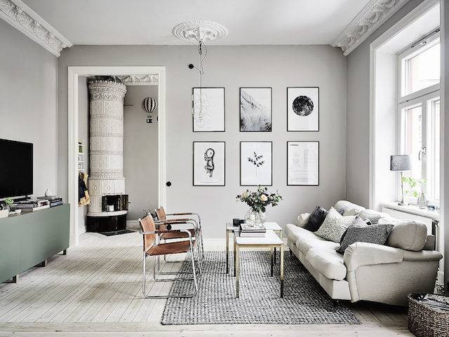
This next room takes a different approach leaning toward uniformity, but look closely, it still abides by our rule:
-Contrast: the scale and style of the subject matter varies
-Continuity: the frames, sizes and colors (or lack thereof) are uniform
Now, you may see the next room and think to yourself, “I see contrast but no continuity...and it looks great!” I agree. This is one of my favorite groupings. However, we are only looking at one wall of the room and that is different than looking at the whole. If we could zoom out to see the whole room what do you think would look better on the opposing wall: something completely different from each of these already unique pieces, or artwork with one or two features that connect it with this grouping? That, my friend, is a topic for another blog.
To comment on this post, please visit my blog on
Art is Not an Afterthought
January 25, 2018

Often when a new home is built or an existing one is redecorated, art selection occurs at the end of the process and is used as an accessory. While there’s nothing wrong with this approach, a person may be left with less freedom to choose artwork they’re passionate about. There can be a struggle with forcing a match with the décor rather than placing beloved art. To avoid this predicament, treat art, not as an afterthought, but as part of your palette from the start.
Whether you have a treasured piece that has been handed down to you through the family line or can’t stop thinking about a piece you spied in last weekend’s art walk, take a picture of the piece you feel passionate about and pin it to a design board along with your wall color, carpet/flooring samples, furniture inspirations, and other trims and finishes. Do they coalesce? If yes, wonderful! If not, you have more work to do but don't forget - better now than once it’s too late!
Often the art we select reflects our favorite color palettes. If, after taking some time to absorb the overall look you’ve created, you are still struggling with how things meld, take a step back and flip through some magazines or go to galleries. Collect pictures that successfully display the genre of art or colors you have in your palette within a room. Create a separate design board and let them sink in. If you give yourself a little space to absorb and ponder both design boards, you may end up with a room you never expected but are extremely excited about, with conversation-provoking artwork that is well integrated and reflects who you are.
To comment on this post, visit my blog on
Hotels and Intentional Art
September 15, 2017
Having my artwork selected for the Westin at the Denver International Airport has heightened my awareness of the strategic thought that goes into planning a visually interesting experience for hotel guests. Whether a hotel strives to be memorable to travelers via consistency and a recognizable brand or via distinctness of character, being memorable is the key, and artwork can achieve this goal.
Art installation, though at the end of most construction schedules, cannot succeed as an afterthought. Art is the finishing touch, the icing on the cake, and savvy hotel owners know this. Some of the most well-known design, luxury and boutique hotels have achieved their fame because of their art installations. Often willing to take risks with art, they understand that something extraordinary spreads by word of mouth, and when done right, can actually create a hotel’s identity.
New York’s Gramercy Park Hotel is a destination that thoughtfully decorates its walls and then continually changes the selection so that guests are likely to see something new with each visit.
.png)
Each level of the ART hotel in Denver, CO features a different artist’s work.
The Rosewood Hotel Georgia in Vancouver, BC was renovated in 2011 and now holds “North America’s largest collection of privately held Canadian contemporary fine art.”1
Art is intentional in any setting. Take the time to scan the room while enjoying dinner at your favorite restaurant or while shopping for shoes at Nordstrom. Consider the curator’s intentions. Observe the impact of art all around us.
To comment on this post, visit my blog on
Art installation, though at the end of most construction schedules, cannot succeed as an afterthought. Art is the finishing touch, the icing on the cake, and savvy hotel owners know this. Some of the most well-known design, luxury and boutique hotels have achieved their fame because of their art installations. Often willing to take risks with art, they understand that something extraordinary spreads by word of mouth, and when done right, can actually create a hotel’s identity.
New York’s Gramercy Park Hotel is a destination that thoughtfully decorates its walls and then continually changes the selection so that guests are likely to see something new with each visit.
(Image from: HS2 ARCHITECTURE: https://hs2architecture.com/gramercypark.html)
Each level of the ART hotel in Denver, CO features a different artist’s work.
(the ART Hotel in Denver, CO. Image from: https://www.wmagazine.com/story/the-art-hotel-denver-colorado)
The Rosewood Hotel Georgia in Vancouver, BC was renovated in 2011 and now holds “North America’s largest collection of privately held Canadian contemporary fine art.”1
(Rosewood Hotel Georgia, Vancouver, BC, Canada. Image from: http://farmboyfinearts.com/about/)
Art is intentional in any setting. Take the time to scan the room while enjoying dinner at your favorite restaurant or while shopping for shoes at Nordstrom. Consider the curator’s intentions. Observe the impact of art all around us.
To comment on this post, visit my blog on
Citations: 1: http://farmboyfinearts.com/work/hospitality/rosewood-hotel-georgia/
A Snapshot in Time
March 30, 2017
Life is an accumulation of snapshots taken by the lens of our eye and stored in the iCloud of our brain. Throughout life, we’re recording places, faces, events, and images that have made an impact on our life. Our brain has the ability to catalog memories and images that are waiting to be accessed.
I’ve become aware of this phenomenon since I’ve begun my photographic journey of looking for what we can’t see, trusting what we don’t know, and trying to capture the unexplored in an image. Here’s an example of how I flipped through the snapshots of my memory to create one of my pieces of art, from inspiration memory to the final art piece.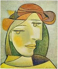
For years I’ve admired Modernism and Expressionism and one can’t help but be aware of the Cubist movement, particularly Picasso.
I admit I’ve struggled with appreciating Picasso, but his work continues to last, influence and impacts so much of life.
(photo from rz100arte.com)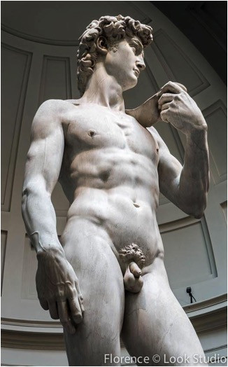
Several years ago I was in Florence, Italy, and of course had to see Michelangelo’s, David. We’ve all seen the pictures but I wasn’t prepared for the strength, beauty, and magnitude of the sculpture in person.
Photographs don’t do justice to the phenomenal grace and power that he carved from marble. It’s truly breathtaking.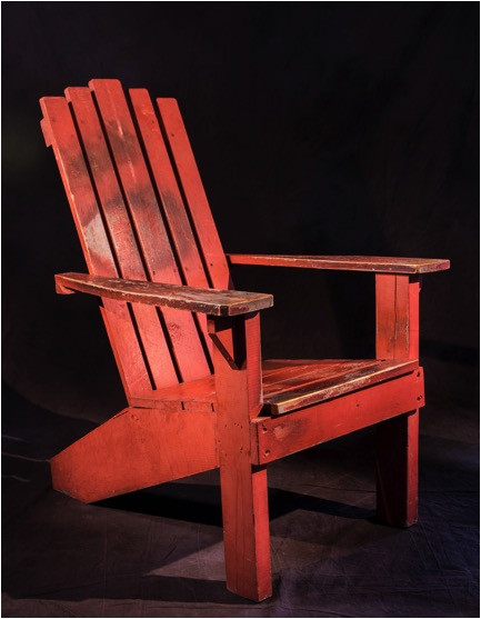
I found this vintage homemade Adirondack style chair in an antique store in Texas years ago. The years and layers of paint revealed an intriguing combination of red, blue, and ochre colors.
There was an area on the arm of the Adirondack chair with all those colors showing together that caught my eye and the culmination of Memory Snapshot #1 through #3 created the art piece below titled Picasso’s, David.
To me, it looked like a God stretched across the sky moving among the ethereal wisps of the cosmos. Here’s the brain snapshot part: I saw a crown of curls, like the head of Michelangelo’s David, and I saw two eyes slightly off and a twisted mouth, similar to much of Picasso’s work, and hence, the name Picasso’s David. That’s what came out of my memory image recall and inspired my vision with this piece.
What I like about abstract art as a whole and the type of photography I do, is that everyone is looking at the art from the view of their own memory recall. Each person has a completely different set of references. It’s nice when someone sees what I see, but I’m always delighted to know what they see and what my images mean to them. It’s art, there’s no right or wrong, there’s just appreciation for the creativity that’s within all human beings…and for me the adventure of discovering other worlds beyond the surface.
Picasso’s David is available through the Ann Korologos Gallery in Basalt, Colorado
I’ve become aware of this phenomenon since I’ve begun my photographic journey of looking for what we can’t see, trusting what we don’t know, and trying to capture the unexplored in an image. Here’s an example of how I flipped through the snapshots of my memory to create one of my pieces of art, from inspiration memory to the final art piece.
Memory Snapshot #1
Picasso
For years I’ve admired Modernism and Expressionism and one can’t help but be aware of the Cubist movement, particularly Picasso.
I admit I’ve struggled with appreciating Picasso, but his work continues to last, influence and impacts so much of life.
(photo from rz100arte.com)
Memory Snapshot #2
Michelangelo
Several years ago I was in Florence, Italy, and of course had to see Michelangelo’s, David. We’ve all seen the pictures but I wasn’t prepared for the strength, beauty, and magnitude of the sculpture in person.
Photographs don’t do justice to the phenomenal grace and power that he carved from marble. It’s truly breathtaking.
Memory Snapshot #3
Adirondack Chair
I found this vintage homemade Adirondack style chair in an antique store in Texas years ago. The years and layers of paint revealed an intriguing combination of red, blue, and ochre colors.
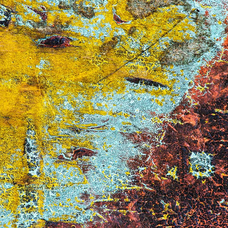
Result
Picasso's DavidThere was an area on the arm of the Adirondack chair with all those colors showing together that caught my eye and the culmination of Memory Snapshot #1 through #3 created the art piece below titled Picasso’s, David.
To me, it looked like a God stretched across the sky moving among the ethereal wisps of the cosmos. Here’s the brain snapshot part: I saw a crown of curls, like the head of Michelangelo’s David, and I saw two eyes slightly off and a twisted mouth, similar to much of Picasso’s work, and hence, the name Picasso’s David. That’s what came out of my memory image recall and inspired my vision with this piece.
What I like about abstract art as a whole and the type of photography I do, is that everyone is looking at the art from the view of their own memory recall. Each person has a completely different set of references. It’s nice when someone sees what I see, but I’m always delighted to know what they see and what my images mean to them. It’s art, there’s no right or wrong, there’s just appreciation for the creativity that’s within all human beings…and for me the adventure of discovering other worlds beyond the surface.
Picasso’s David is available through the Ann Korologos Gallery in Basalt, Colorado