Look Studio decorates the new Westin DIA
October 21, 2015
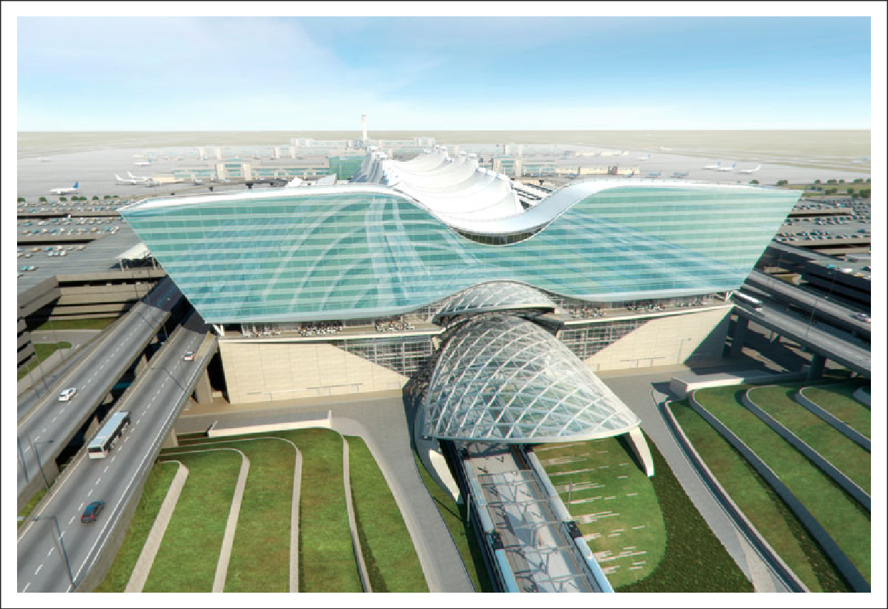
Two years ago, over 200 Colorado artists submitted artwork to the Westin for consideration in the 519 room Gensler-designed hotel under construction at the Denver International Airport. The selection committee was looking for contemporary art that represented nature in the West. The philosophy behind the hotel’s interior design was intriguing:
“Our well-being is affected by an innate need to connect with nature and link to the natural world. Accents and design details in the hotel are inspired by the natural world—recalling abstracted biomorphic shapes, textures, materials and themes (fractals, geologic patterning and micropatterning).” (Source: DIA Art & Culture Program)
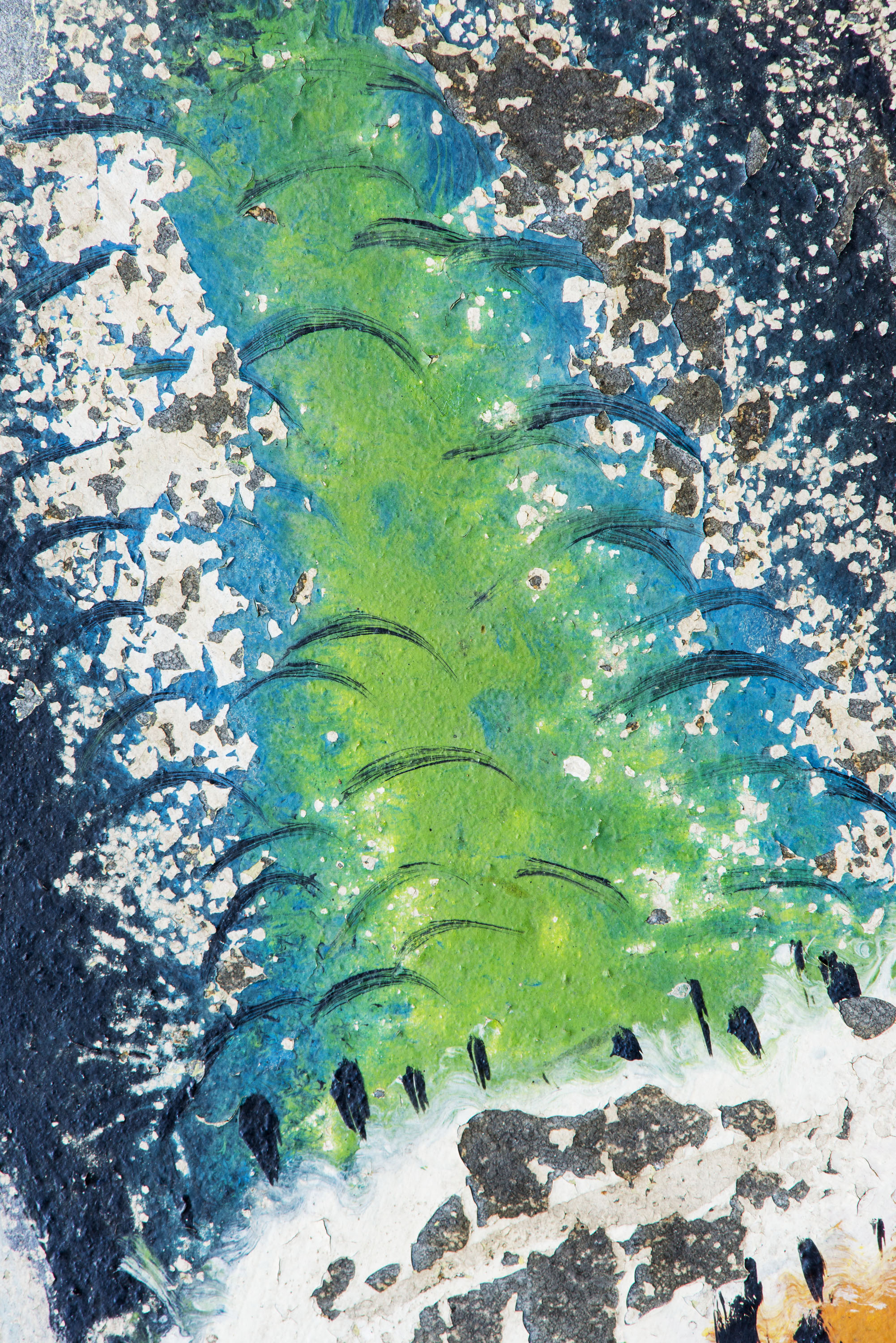
In July 2013, I was selected as one of 10 artists to have their art featured in the private rooms and corridors of this notable hotel. Their mission statement spoke to me and seemed like a good fit for my photography. I was thrilled when five of my images were chosen for this beautiful hotel.
Over two years later, the Westin’s thoughtfully planned hotel will open on November 19, 2015. DIA is hosting room previews and festivities on November 14th and 15th.
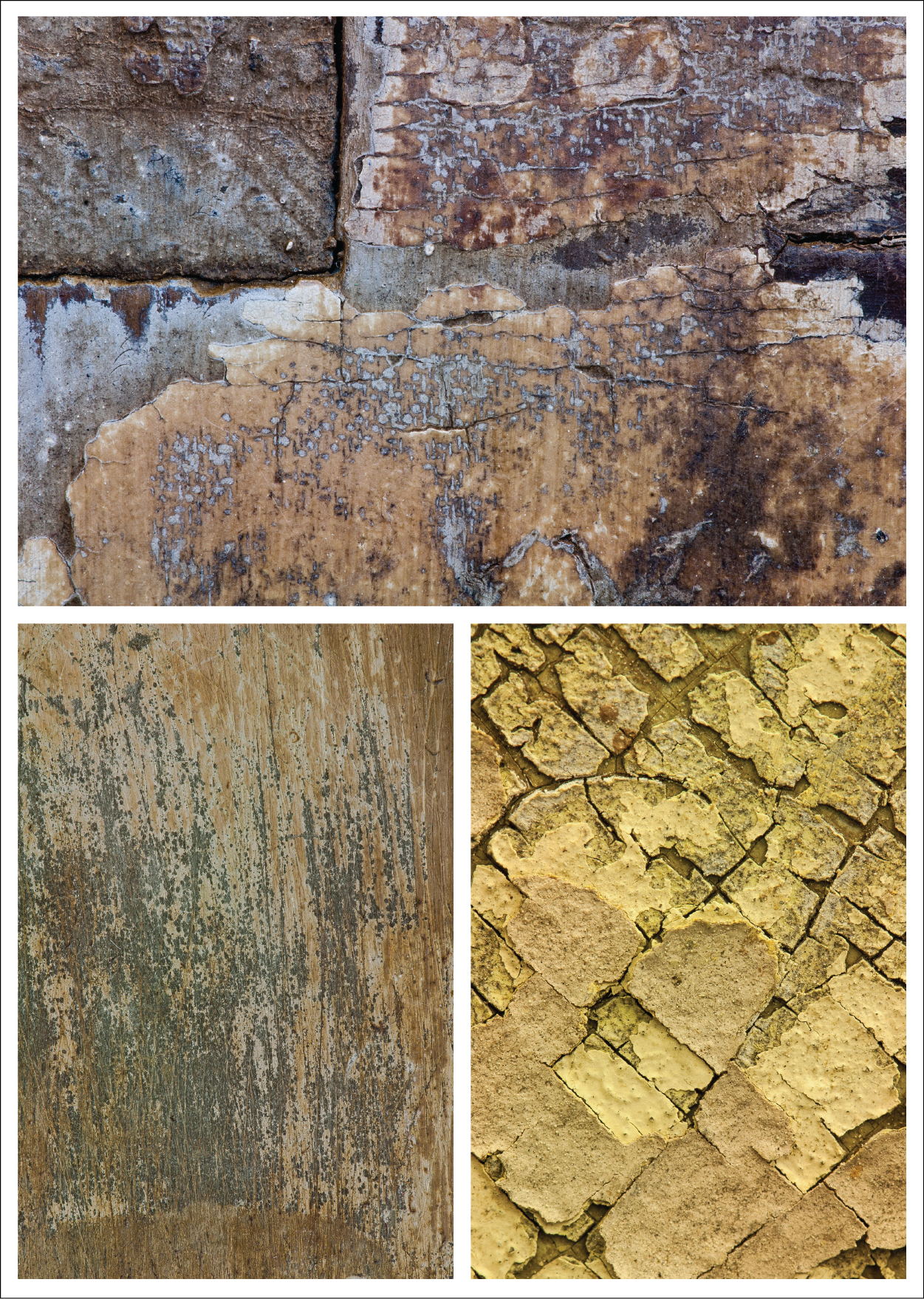
Also of interest is the incredible sculpture by Patrick Marold of Denver, CO. He has created a $1.5m large scale public space sculpture out of 250 beetle-kill logs from Southern Colorado. Patrick’s work is truly inspiring: http://patrickmarold.com. His appreciation of reclaimed materials speaks to the genesis of my photography and I’m honored to be part of a facility dedicated to the renewal experience of nature.
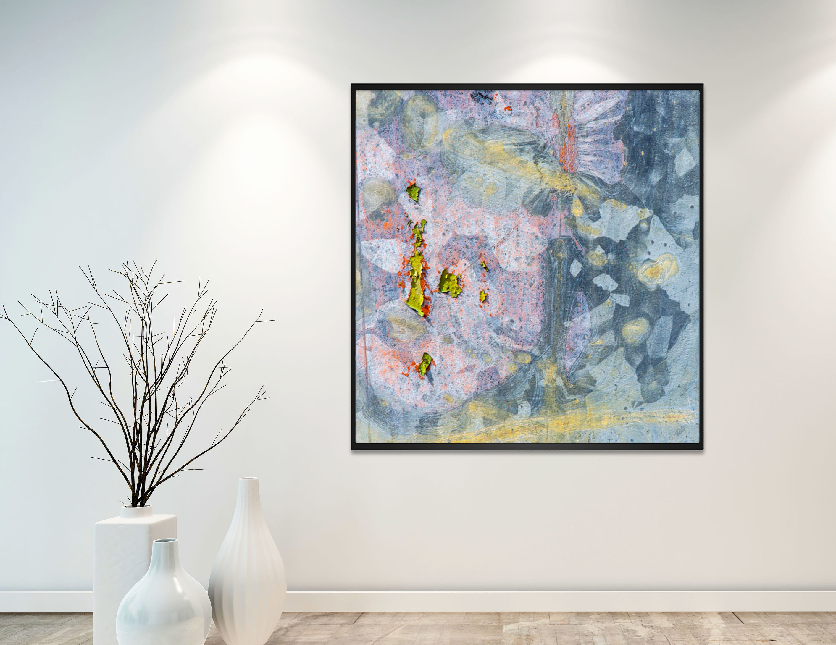
Here’s a sneak preview of what they selected:
Thank you. As always, I appreciate your support!
To comments on this post please visit my blog on

3 Compelling Reasons to put ABSTRACT ART on Your Wall
August 20, 2015
Reason #1: Abstract art is a conversation starter: Abstract art can be interpreted differently by each viewer and naturally prompts interesting conversation.
Reason #2: Abstract art can guide interior design: If a room in your home needs a facelift, pick a piece of abstract art that speaks to you, and let it guide the color palette or room decor.
Reason #3: Abstract art mingles with anything: The right abstract piece will fit with modern, traditional, rustic, vintage, country (you name it!) decor.
For other compelling images of interior decor and abstract art, please visit my pinterest board "Decorating with Abstract Art".
To comment on this post please visit my blog on
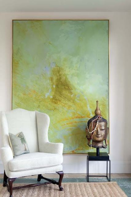
Try Something Unexpected: Color and Décor
April 23, 2015
I am passionate about décor, abstract art and color; specifically a combination of the three. As an abstract photographer I often spend my days literally focused on colors. The play between colors within my viewfinder must be intriguing for me to snap the shot. My images may focus on a 1 or 2” square area, but when blown up 600 times their size, the color-play that initially caught my eye is impactful with sometimes surprising results. It takes time, patience and risk to generate a stirring piece of art.
Don't be afraid that you’ll tire of a surprising color you’ve decided to use within your décor. If done right, rooms like the one Martha Angus created remain compelling and a pleasure to be in for years on end.
If you're interested in bringing color-play into your home, you can view my latest abstract art here http://www.lookstudio.net/galleries/latest-images.
To comment on this post please visit my blog on
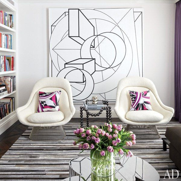
I think the same methodology holds true for interior décor and composing an intriguing space. If you’ve read any of my previous blogs you probably know that when designing a room I advocate beginning with a neutral interior. Once you’ve created your blank slate try something unexpected.
Purple is not my favorite color. I wouldn’t purposefully decorate with it. However I’m completely fascinated by this room from Luxe Magazine. The colors throughout the room are each unique - the violet throw, the deep purple pillow, the mauve/plum of the abstract art – yet they have a subtle connection within their hue. It's when designer Martha Angus brings in unpredictable colors, the rich burnt umber of the chairs and surprising cobalt blue table, that the room elevates to captivating.
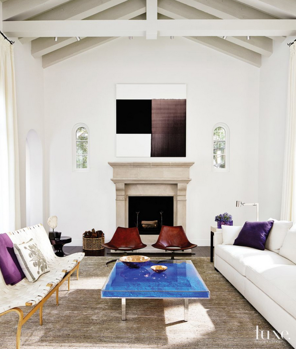
Purple is not my favorite color. I wouldn’t purposefully decorate with it. However I’m completely fascinated by this room from Luxe Magazine. The colors throughout the room are each unique - the violet throw, the deep purple pillow, the mauve/plum of the abstract art – yet they have a subtle connection within their hue. It's when designer Martha Angus brings in unpredictable colors, the rich burnt umber of the chairs and surprising cobalt blue table, that the room elevates to captivating.
Don't be afraid that you’ll tire of a surprising color you’ve decided to use within your décor. If done right, rooms like the one Martha Angus created remain compelling and a pleasure to be in for years on end.
If you're interested in bringing color-play into your home, you can view my latest abstract art here http://www.lookstudio.net/galleries/latest-images.
To comment on this post please visit my blog on
Follow Your “Art”
February 18, 2015
Ah, February, the month of love. Here’s a tip that will never break your heart. Follow Your “Art”! This inspiration comes from Mia Romanik, Art Advisor for Luxe Magazine who says, “for me, when I’m looking for pieces [of art], it’s always instinctual—a feeling I get about the work. Then, I follow the artist for a while, and if that feeling stays, I’m sold; I’m a believer.”
That’s what’s great about the Internet and having access to so many resources online. While you’re contemplating color, form and how you instinctively feeling about a piece of art, not to mention saving up to purchase the art, you can follow artists that you like. Whether you aspire to own their work or just enjoy what they create, you can watch their websites, Pin them, or follow galleries where their work is shown. As an artist, I can tell you, we like to be followed. And the best part, following is free! So while you’re saving your pennies or convincing your spouse that you really need that piece of contemporary art in your living room, you can indulge in following your favorite artists to see what they’re up to and what they’re creating.
And if your Valentine’s day flowers have wilted or that box of chocolates is empty consider a little gift for yourself…one that will last. Follow your heart and buy some art!
Here are some artists I enjoy following:
Michael Kessler
Hyunmee Lee
Robert Langford
Theodore Waddell
To comment on this post please visit my blog on
Do You See Penguins?
February 13, 2015
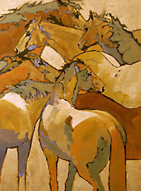
Form is a critical part of what we evaluate when looking at art. My current show at the Ann Korologos Gallery was inspired by form and color. Peggy Judy’s acrylic paintings and my abstract photographs create a unique mixture and contrast of the use of form. The beautiful forms within Peggy’s paintings, are somewhat abstract, but recognizable shapes as horses, Indians and Western landscapes; while the forms within my abstract photography are less specific and open to interpretation.
Here are some of my other thoughts on form:
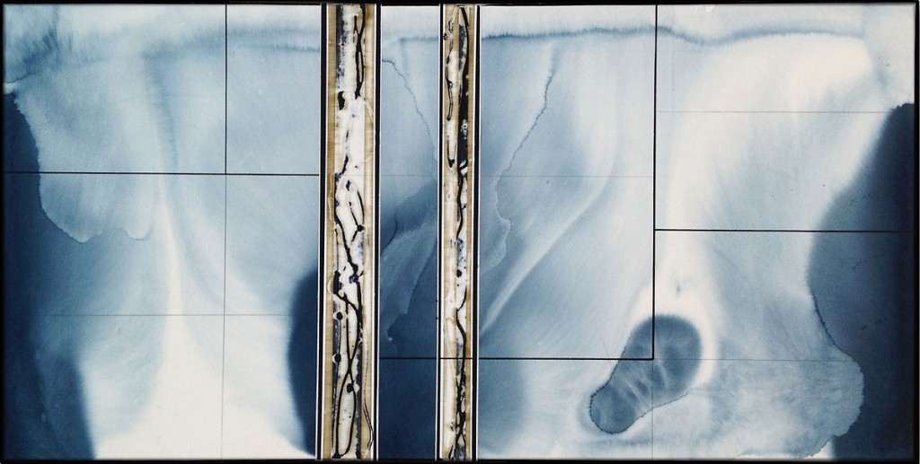
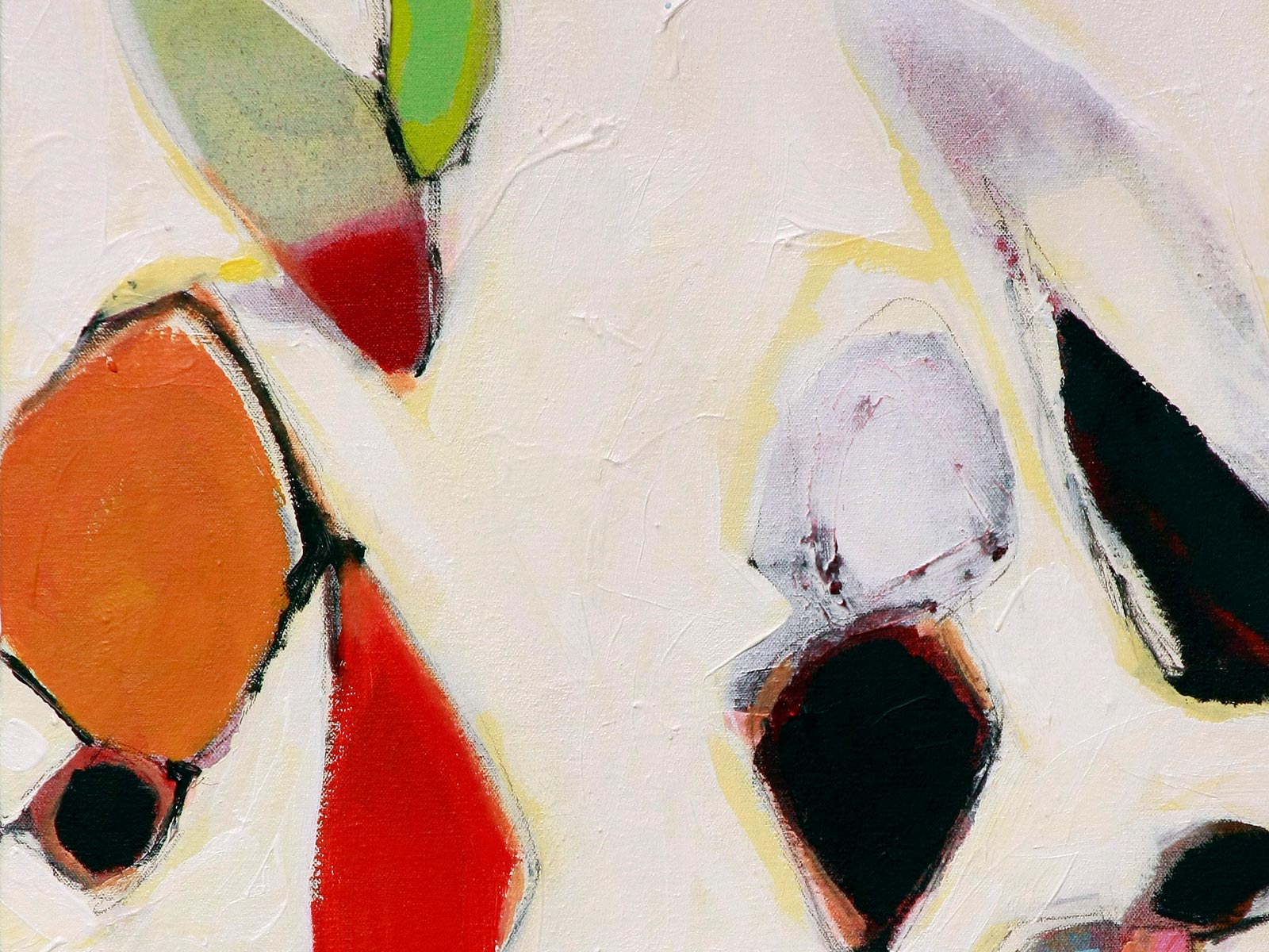
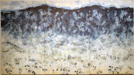
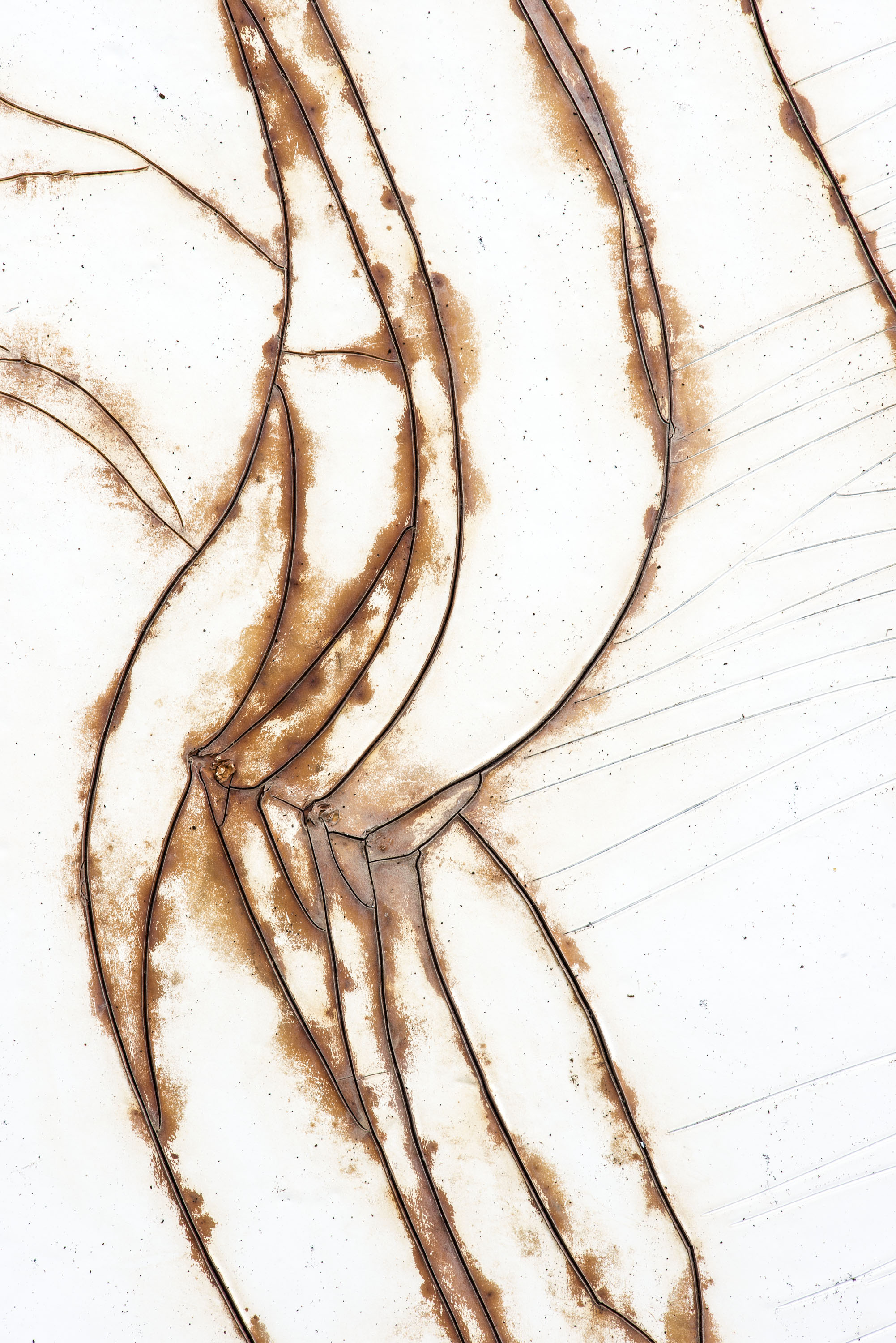
Form is the manifestation of expression. It is the movement, the message, the impact of art. Color and general aesthetic may reel us in but form sets the hook. My “Life in Motion” triptych is an example of the influence of form. With a white background the fluidity of the rust-colored lines make these pieces primarily about the expression of movement. The message is abstract allowing each person to find their own connection to its meaning. When I look through the viewfinder, I’m searching for an abstract form that can inspire and remain open to interpretation.
To comment on this post please visit my blog on
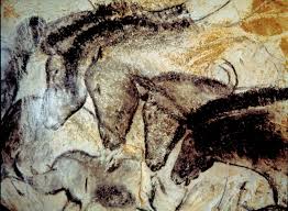
(Caballos Chaos by Peggy Judy & Chauvet Cave drawings)
As an artist, I’ve have always been drawn to abstract art's ability to stimulate the mind, and our individual experiences add even more layers to artistic interpretation of form. An example of this is the Christmas card I created this year that originated with one of my abstract photographs. To me it looked like an abstract whimsical tree with black marks on the tree representing branches. To a friend of mine, it looked like penguins sliding down a mountain. There’s no right or wrong. Either interpretation is simply the workings of our individual imaginations.
(Abstract Photograph used for Christmas Card)
Interestingly, we are more comfortable with shapes and forms that we recognize. Our mind remembers familiar shapes from past encounters, and this memory resonates with us. Aspects of this are mentioned in a very interesting book titled Future of the Mind, by Michio Kaku. One of my goals with photography is to push the comfort zone of the mind, to encourage it to grow and stretch and become more comfortable with shapes and forms that may not be so easily recognizable. I believe that increasing our comfort zone with the unknown and exercising our brains to come up with new definitions for what we see may help increase the creativity of our brains. Could this expansion inspire new solutions and new possibilities for the future by broadening the parameters of what is possible? Could abstract art play a part in the evolution of the brain? Is that part of what the classic Abstraction Expressionists intended? To me the answer is "Yes!" Consider petroglyphs; these “forms” were one of the first methods of communication used among early humans roughly 40,000 years ago. Dr. Kaku notes that the use of tools [used to create these forms and in agriculture] helped the brain develop with the distinctly human characteristics to see today.Here are some of my other thoughts on form:
Form is the manifestation of expression. It is the movement, the message, the impact of art. Color and general aesthetic may reel us in but form sets the hook. My “Life in Motion” triptych is an example of the influence of form. With a white background the fluidity of the rust-colored lines make these pieces primarily about the expression of movement. The message is abstract allowing each person to find their own connection to its meaning. When I look through the viewfinder, I’m searching for an abstract form that can inspire and remain open to interpretation.
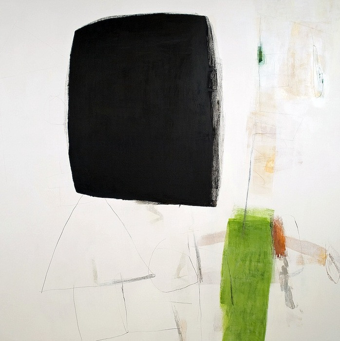
(Express by Look Studio)
Enjoy the challenge of exercising your brain through art. What better way to express your passion and imagination than through viewing or creating a unique piece of art in any size or form.To comment on this post please visit my blog on