Inspiring Interiors
September 4, 2014
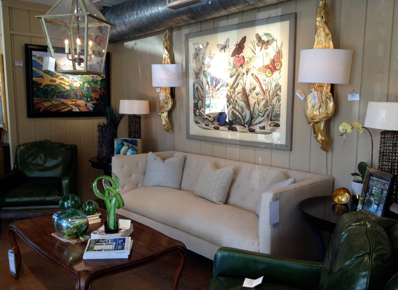
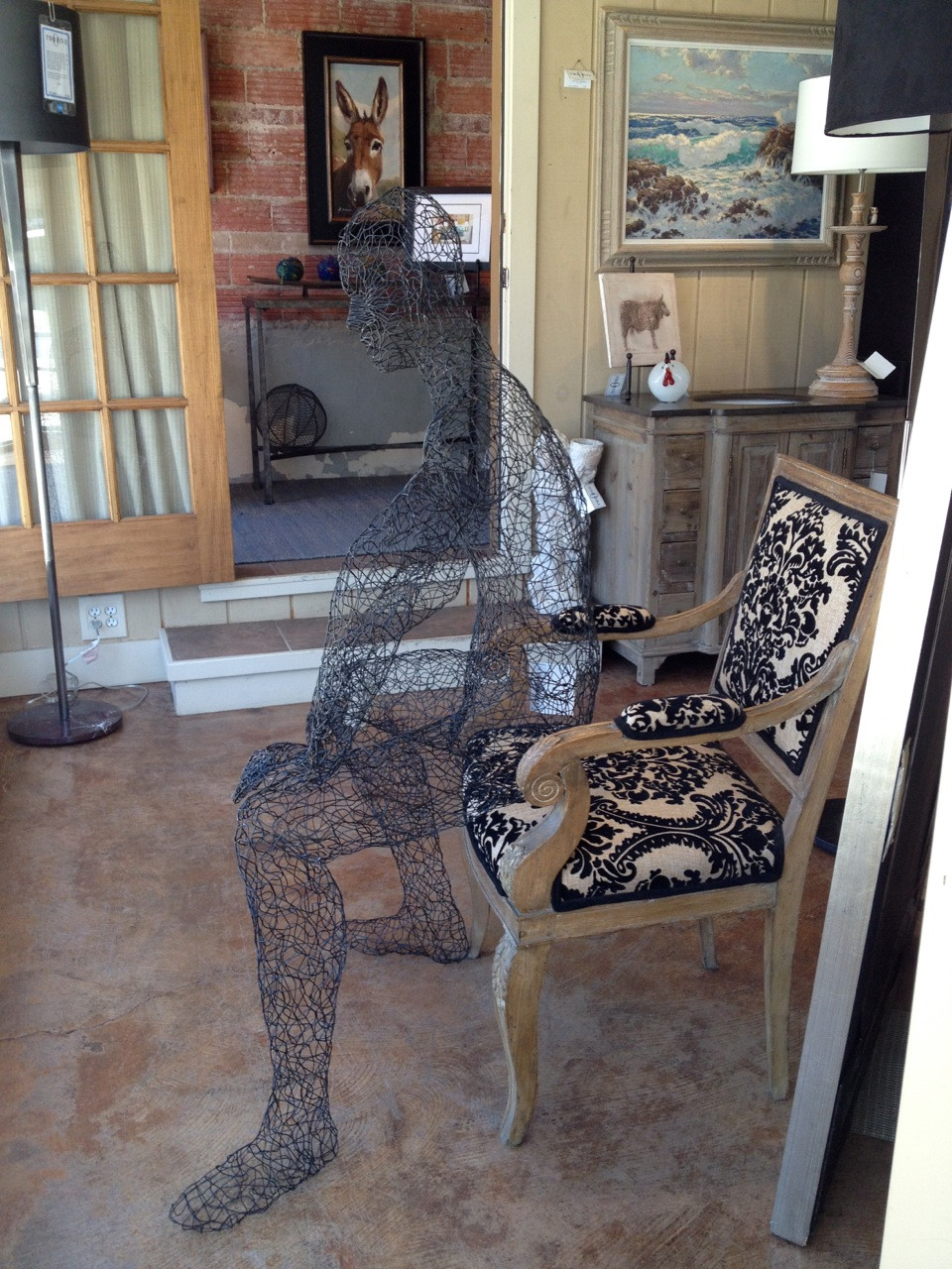
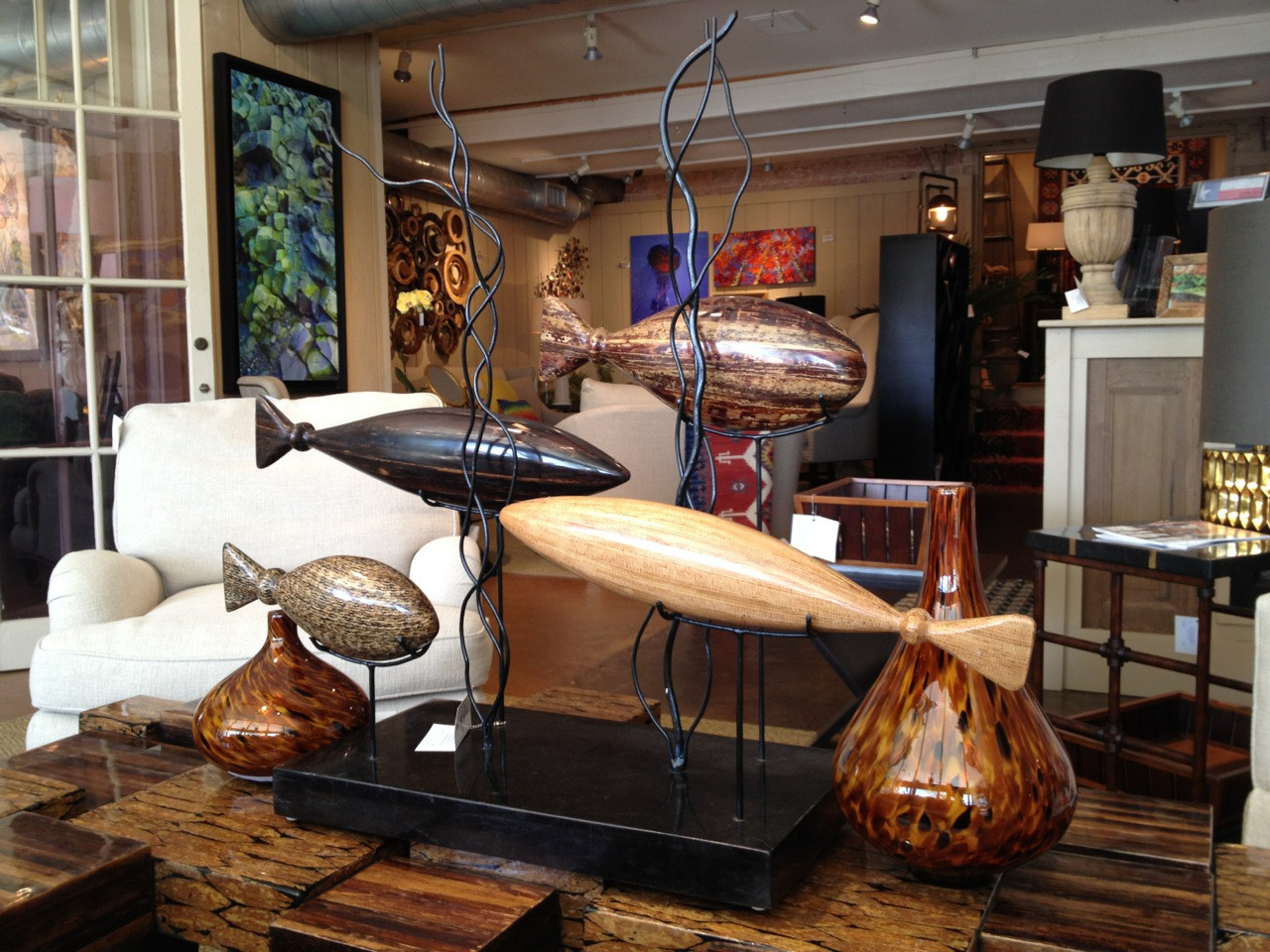
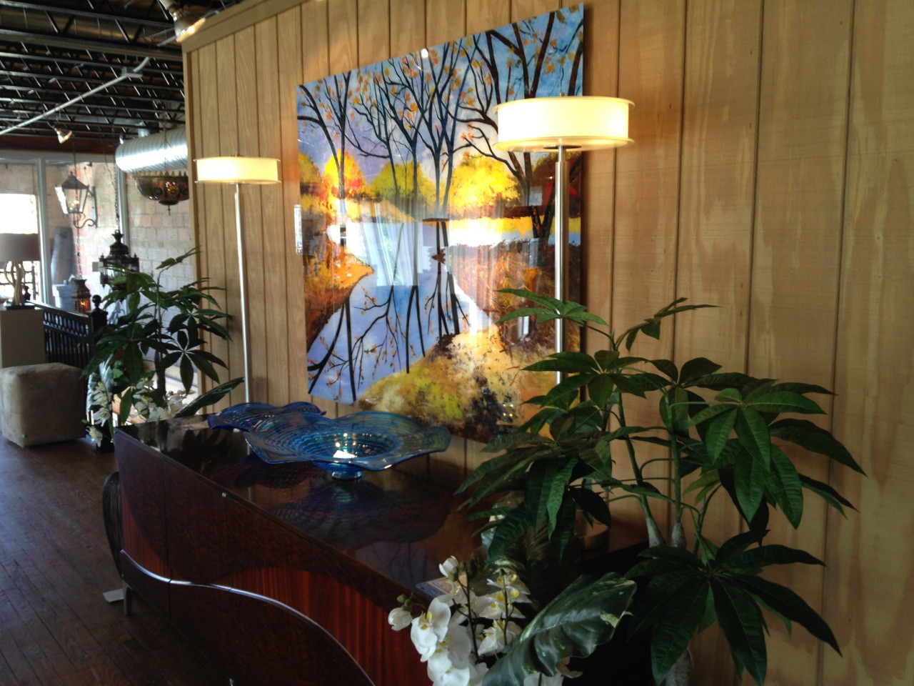
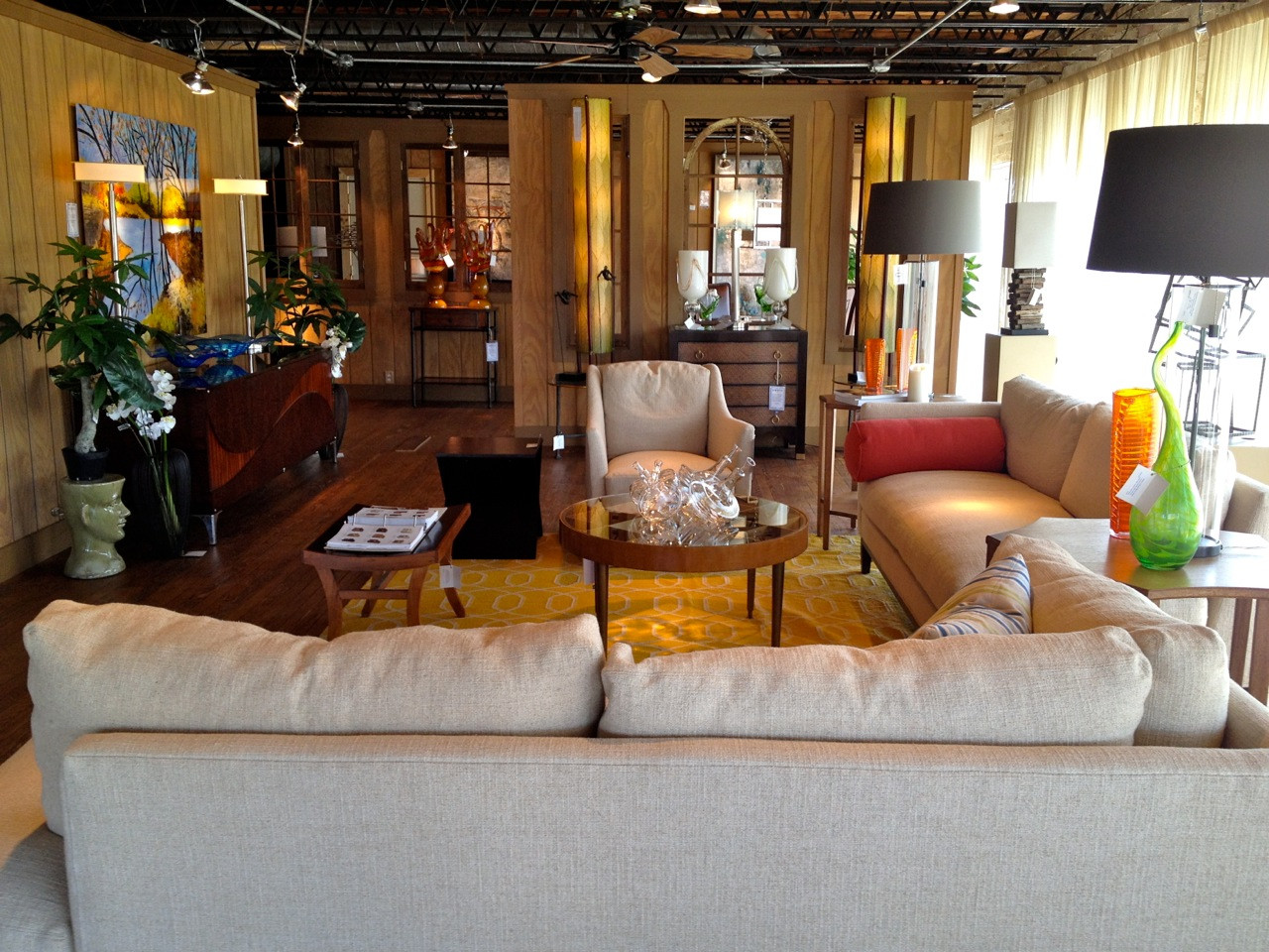
There are so many ideas for interiors to be found online and though it’s great inspiration, there’s nothing like going into a wonderful store and seeing in person products, art, vignettes and ideas that only skilled professionals can create. In a sense, stores that specialize in interiors, especially independently owned stores, are like having your own personal interior designer for free. They display merchandise and show you how to put your room together.
If you are considering redecorating or as the kids go back to school and you begin thinking about your home for the fall and holidays, stop by a store, look around, get ideas, and maybe even purchase something. Store front owners are hard-working individuals who have a lot to offer, and they appreciate our support in this increasingly online world. With their guidance, you may select a beautiful and unique addition to your décor.
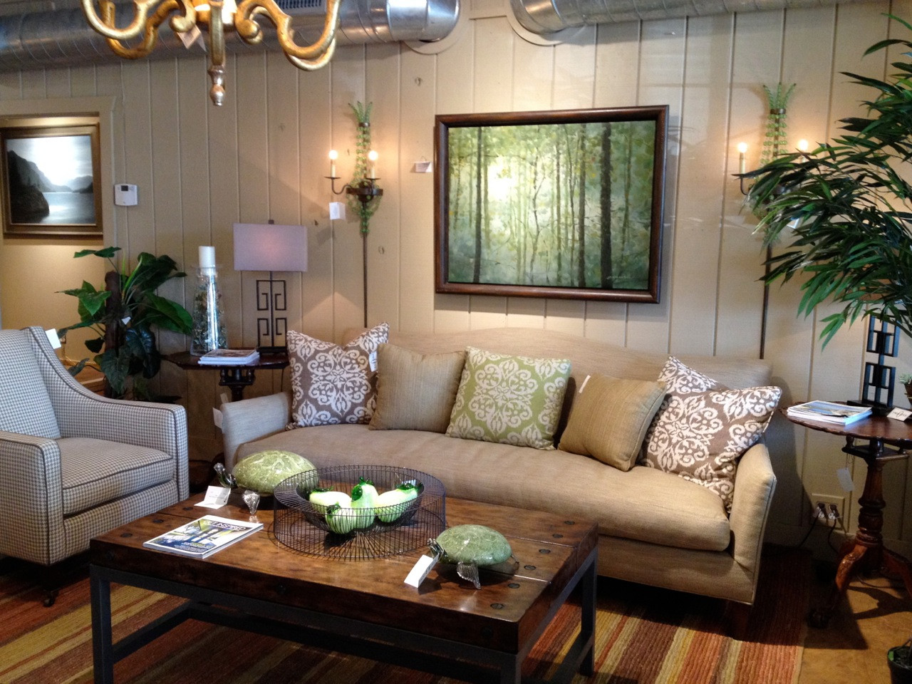
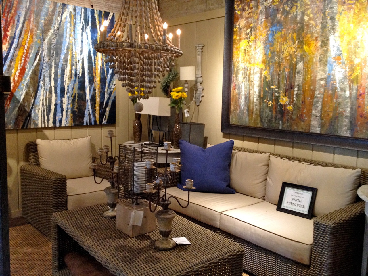
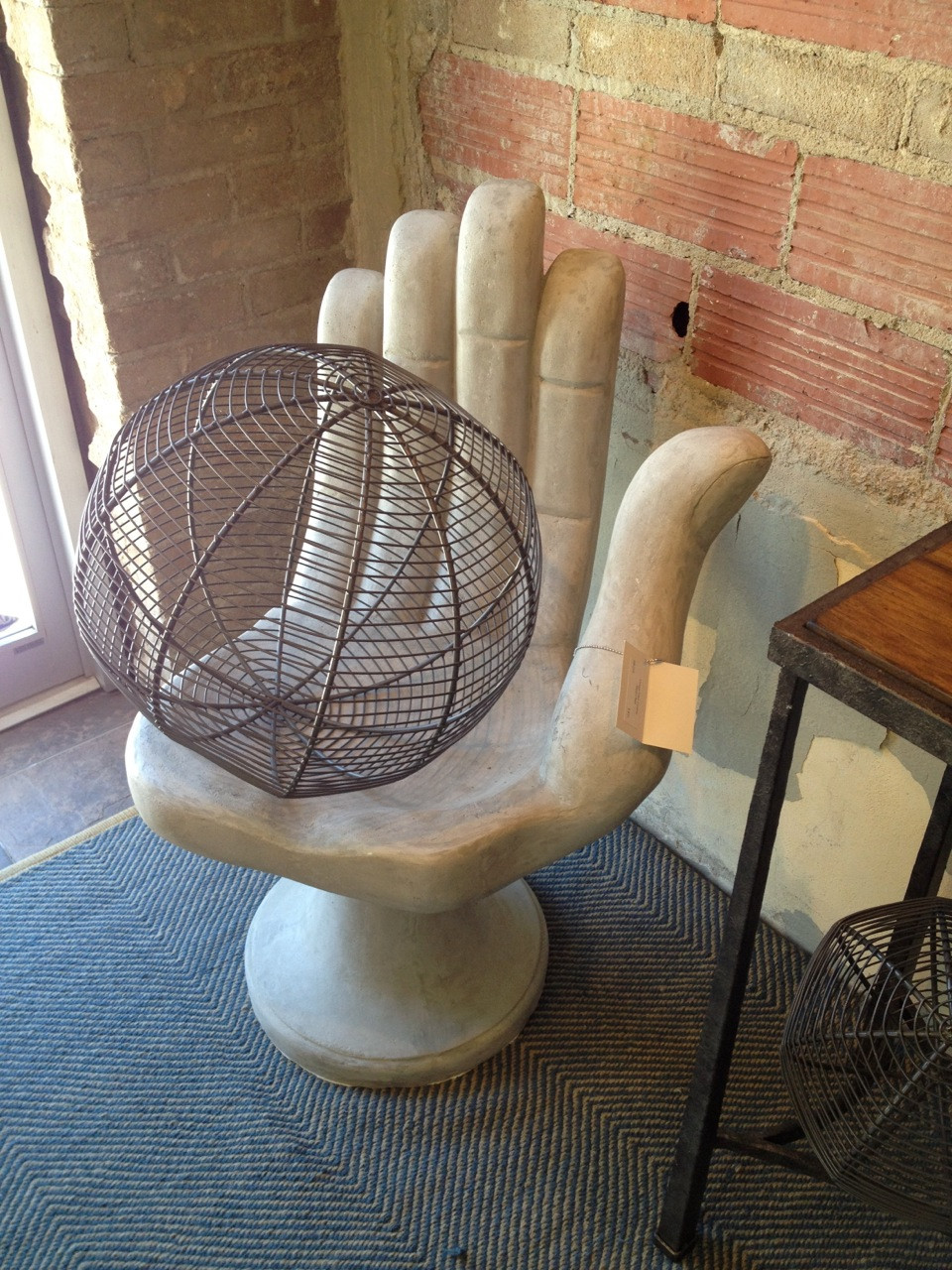
One of my favorite stores for that kind of inspiration is 205 in Kilgore Texas. Located in an old warehouse-type building where the oil boom began in East Texas, this store continues to motivate me with the creativity of Justin DuPont and Harry Crouse as they showcase their “favorites” in interior design. As an abstract photographer, I particularly like their bold and colorful abstract art. Visit them and ask for tips on decorating with abstract art or browse their dispalys to see what an impact art can make in a room. They also specialize in all kinds of “conversation pieces” that you can use to accessorize your home.
Any inspirational stores in your area that you’d like to share? To comment or share please visit my blog on


Vivian Springford’s Abstract Art
August 28, 2014
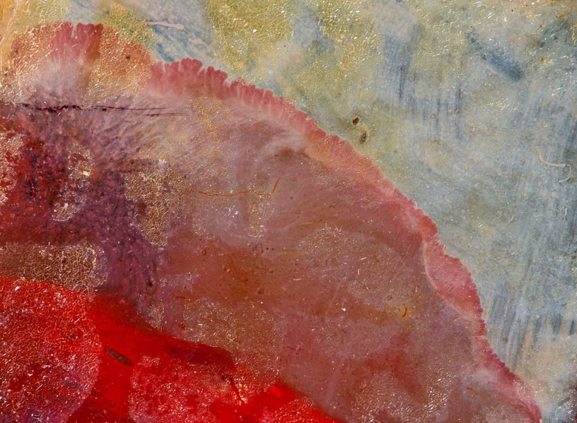
Vivian Springford's work inspires and encourages me in the abstract art that I create. Sometimes when I create a piece of abstract photography, I think "am I crazy?" Surely, I can't be the only artist who's felt that way. I find camaraderie in Vivian's work. Several of her pieces remind me of my image Over the Rainbow (top) (bottom: Springford untitled).
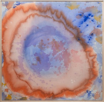
One of her pieces is part of the Expansionist Series (below)...
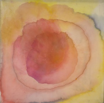
... and that resonants with one of the new Life in Motion pieces I have at the Ann Korologos Gallery titled "Expand" (below: Extend, Expand & Express).
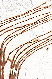
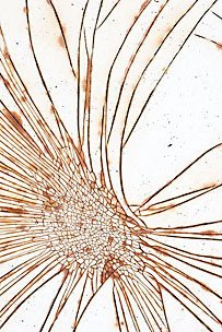
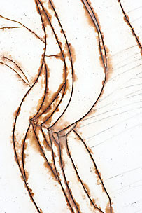
Vivian's work is expressive, fierce and moving with subtly of color. I think you have to be a little crazy to express life through art in the abstract. To appreciate art in the abstract could be a step toward enlightenment.
Vivian Springford: A Retrospective is showing now through September 3rd at the Peyton Wright gallery.
To comment on this post please visit my blog on


One of her pieces is part of the Expansionist Series (below)...

... and that resonants with one of the new Life in Motion pieces I have at the Ann Korologos Gallery titled "Expand" (below: Extend, Expand & Express).


Vivian's work is expressive, fierce and moving with subtly of color. I think you have to be a little crazy to express life through art in the abstract. To appreciate art in the abstract could be a step toward enlightenment.
Vivian Springford: A Retrospective is showing now through September 3rd at the Peyton Wright gallery.
To comment on this post please visit my blog on


The Illusion of Color
August 20, 2014
What if the color of your crayon isn’t really the color you think it is? A couple of weeks ago we got you thinking about colors and what works and what doesn’t for your home. Here’s another challenge in the world of color: The color of your crayon may not look the same on the wall as it does in the box or on the color swatch from the paint store. Depending on what it’s paired with, or as the light and shadows change throughout the day, your favorite color can change dramatically. If your thinking of repainting a room, I strongly recommend painting a large section of a wall and look at it on a rainy day, bright day, at night, with lamps on, curtains open and closed and any other situation you can think of to make sure you like it at all times.
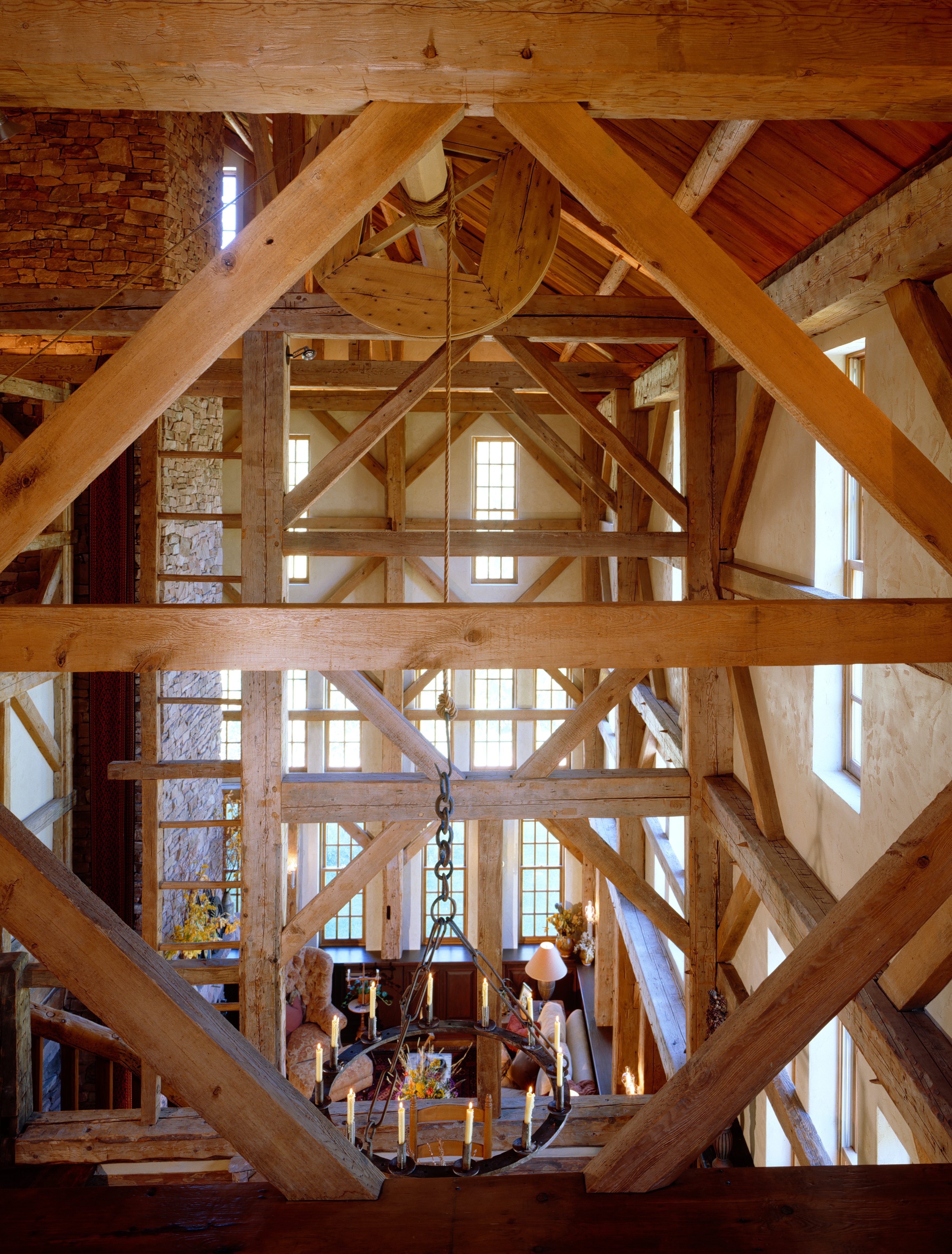
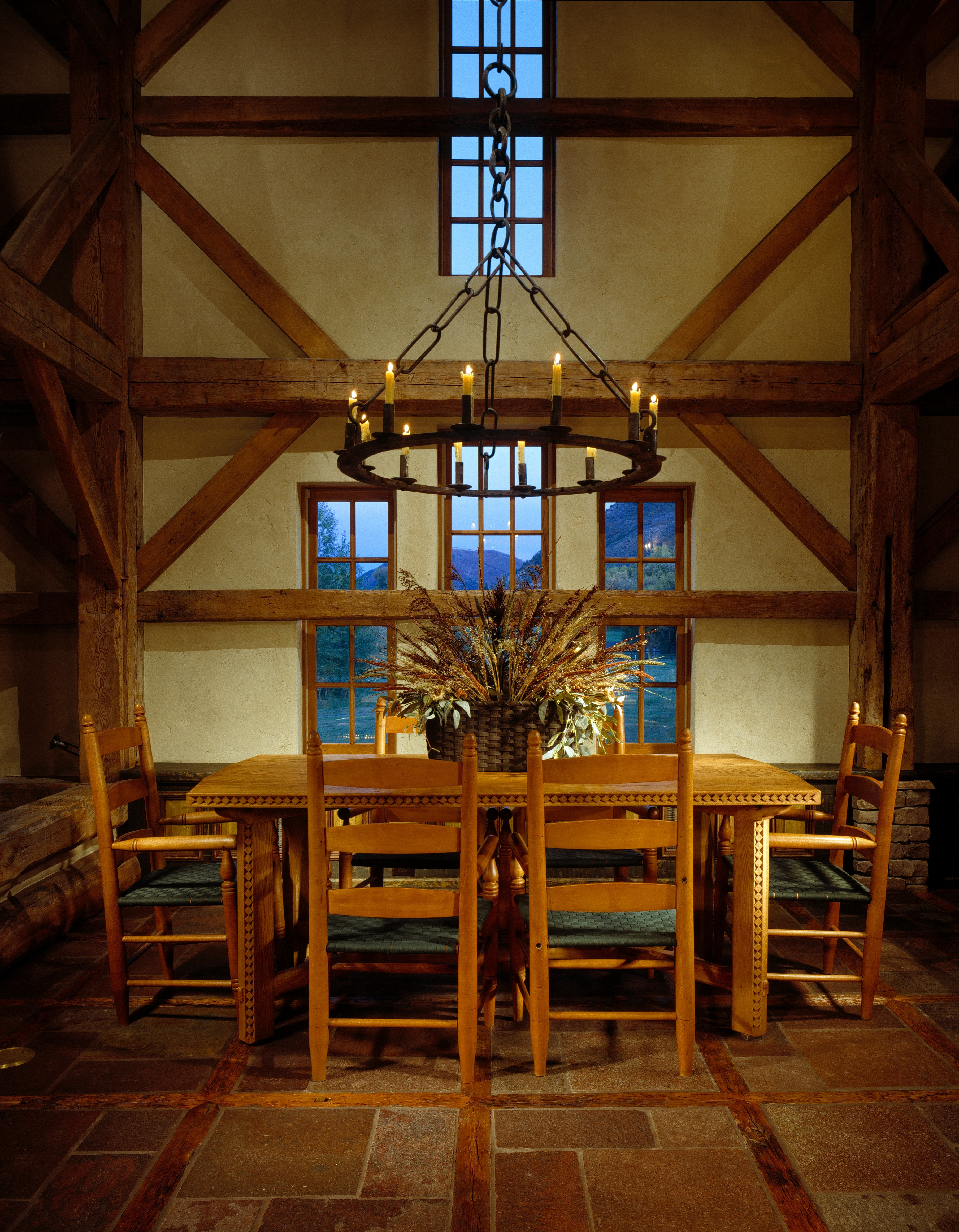
My husband and I restored a barn built in 1800 and we spent weeks looking at colors before we selected the color to be added into the plaster for the walls to complement the antique barn timbers in our home. I can tell you that the color we ended up with was dramatically different from what I originally thought I wanted. I thought I wanted a yellowy/ocher color and ended up with an ivory color. Even if you’re picking a fairly light color, it can turn pink in the evening or get muddy looking or emit a completely different color that you’re not expecting. Selecting a color isn’t just a weekend project, it takes some time and patience, but it’s worth it when it’s right. I haven’t regretted or gotten tired of the color we selected. It’s the perfect complement for the restored structure.
As for art and framing art, the same dilemma applies, especially when you matte and frame a piece of art. A white or light matte is safer for keeping the colors true in your piece. Some people like a matte that accents another color in the room. If it’s on the light side, it can work, but the darker the matte the more color variation can occur in your original piece and it often doesn’t serve the artwork well. The artist or photographer gave a lot of thought to the colors used and it’s best to keep them true. The art is really the accent in the room, not the matte. A black matte and frame can be very dramatic and sometimes it really works, but it will definitely change the look of the colors in your original work.
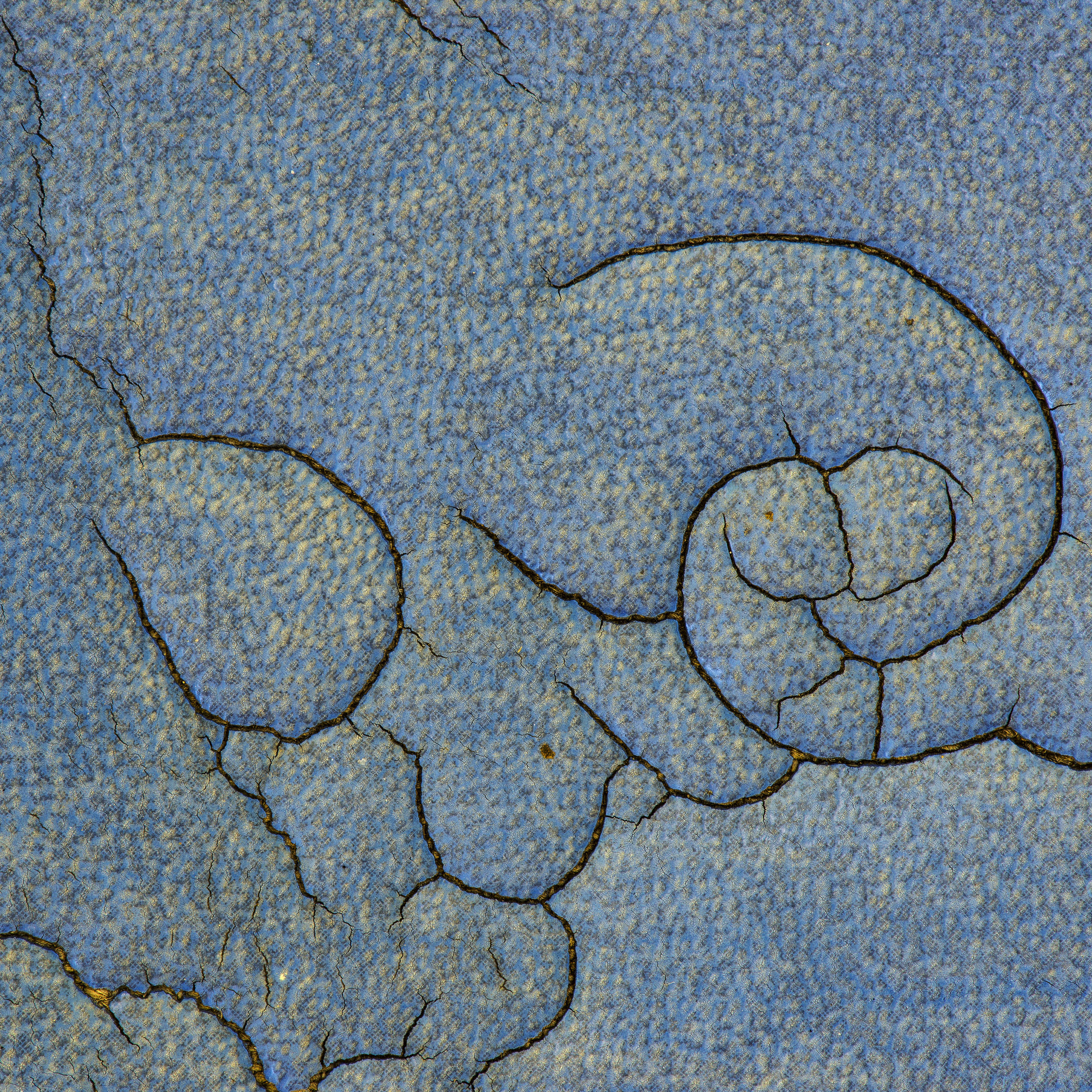
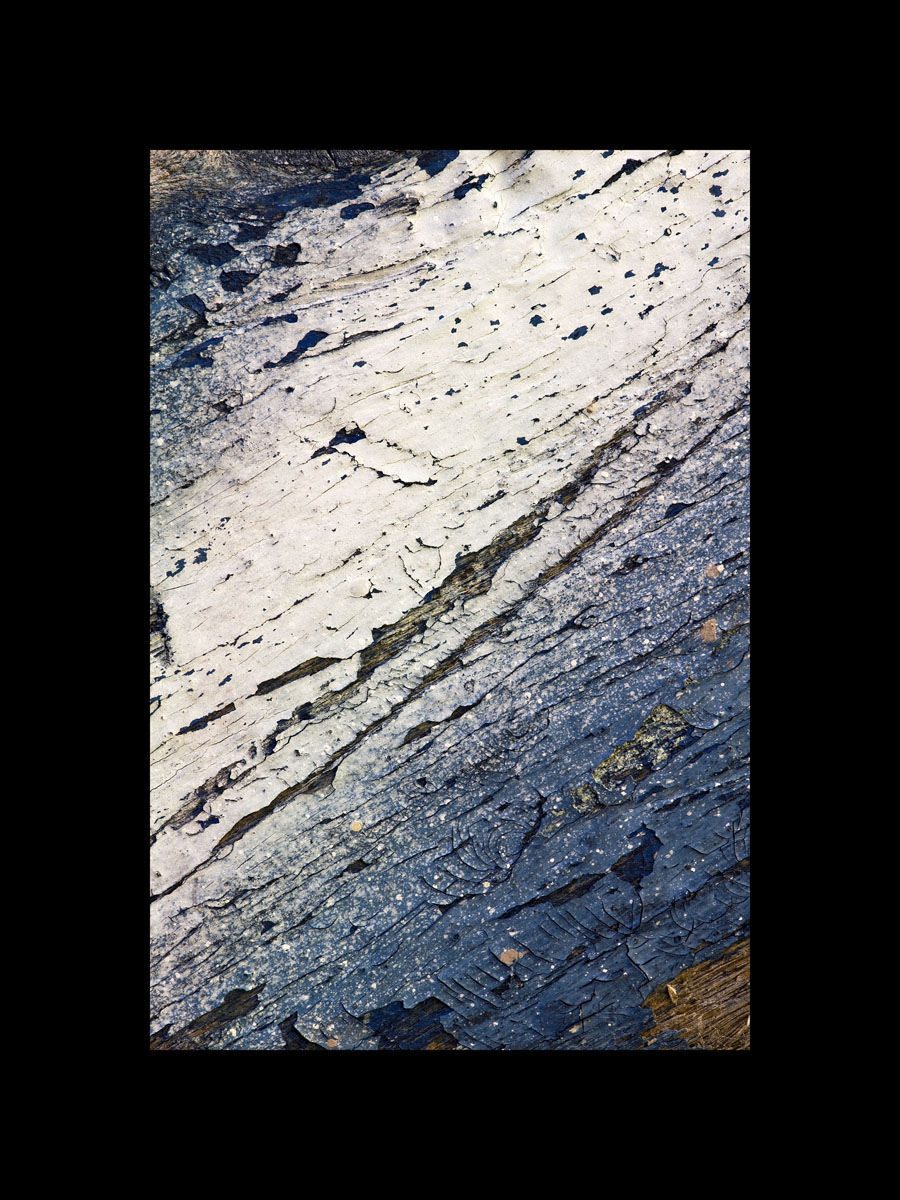
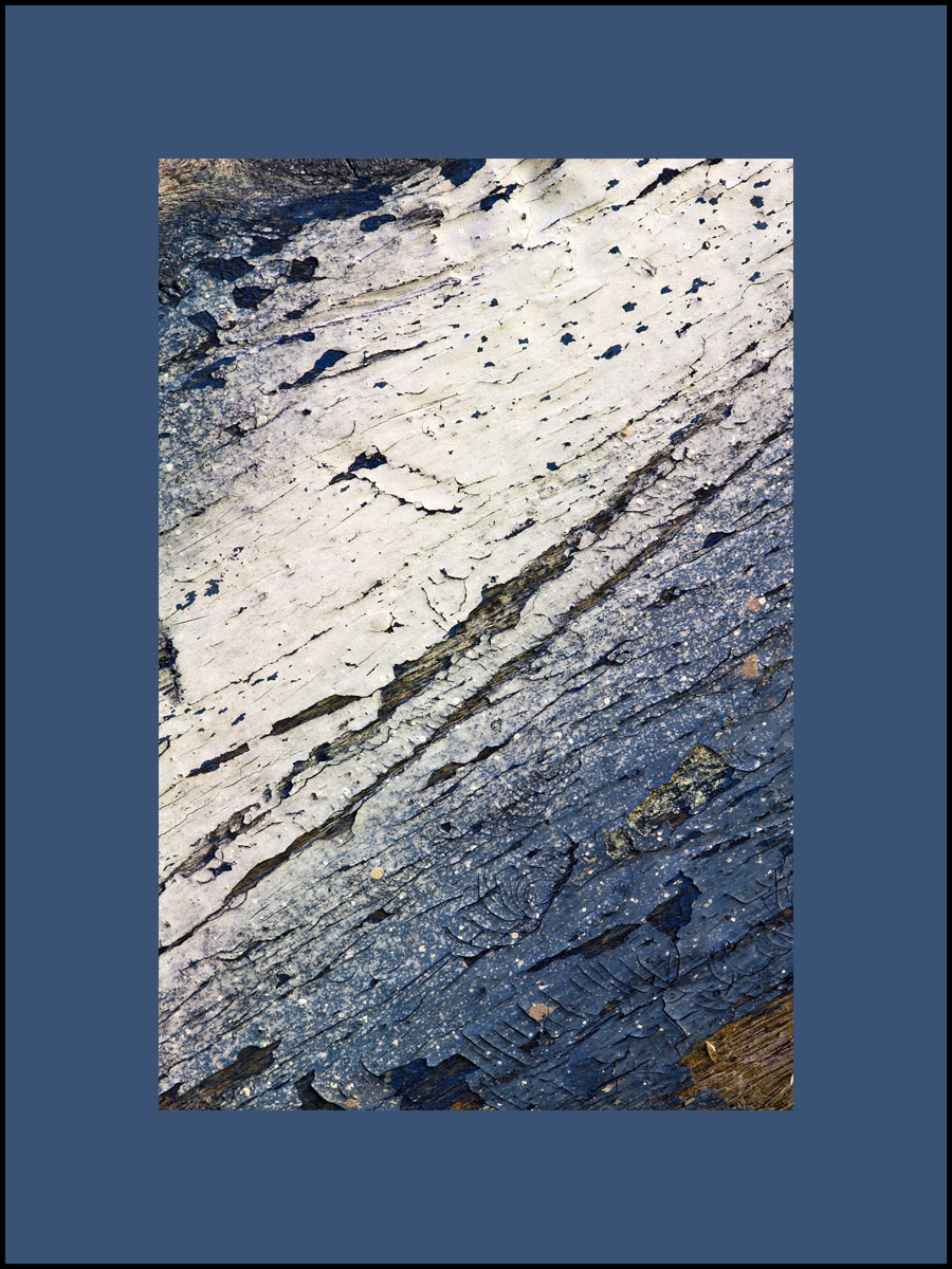
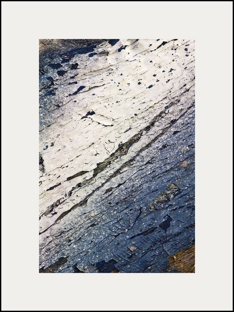
The use of color really is fun and we’ll explore more about it, but be aware of the subtly and illusion of color as you begin to select what’s right for you. Here is an example of one of my pieces of abstract photography, Hang Ten, with different colored mattes. Which do you like the best? To comment on this post please visit my blog on
My husband and I restored a barn built in 1800 and we spent weeks looking at colors before we selected the color to be added into the plaster for the walls to complement the antique barn timbers in our home. I can tell you that the color we ended up with was dramatically different from what I originally thought I wanted. I thought I wanted a yellowy/ocher color and ended up with an ivory color. Even if you’re picking a fairly light color, it can turn pink in the evening or get muddy looking or emit a completely different color that you’re not expecting. Selecting a color isn’t just a weekend project, it takes some time and patience, but it’s worth it when it’s right. I haven’t regretted or gotten tired of the color we selected. It’s the perfect complement for the restored structure.


As for art and framing art, the same dilemma applies, especially when you matte and frame a piece of art. A white or light matte is safer for keeping the colors true in your piece. Some people like a matte that accents another color in the room. If it’s on the light side, it can work, but the darker the matte the more color variation can occur in your original piece and it often doesn’t serve the artwork well. The artist or photographer gave a lot of thought to the colors used and it’s best to keep them true. The art is really the accent in the room, not the matte. A black matte and frame can be very dramatic and sometimes it really works, but it will definitely change the look of the colors in your original work.
The use of color really is fun and we’ll explore more about it, but be aware of the subtly and illusion of color as you begin to select what’s right for you. Here is an example of one of my pieces of abstract photography, Hang Ten, with different colored mattes. Which do you like the best? To comment on this post please visit my blog on


Life in Motion at the Ann Korologos Gallery
August 11, 2014
Visit the Ann Korologos Gallery this month to see "the art and soul of sculpture" in the Material Magic: Six Sculptors Create exhibit running through September 8th. There are some beautiful works including Amy Laugesen's clay horse sculpture. Amy is delightful and I love her clay horses! As usual the sculptures at Korologos are framed by a range of artwork including my newest abstract photographs, Life in Motion.
The Life in Motion pieces represent the movement of life.
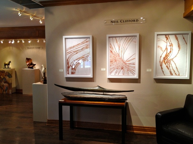
In life, we extend ourselves to others (left), and like the universe, life is about expanding our energy (center) so we can express ourselves with passion (right).
The simplicity and elegance of these pieces dance with the rhythm of life.
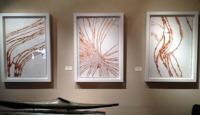
Look Studio's Life in Motion abstract photography above Neil Clifford's Bronze and granite.
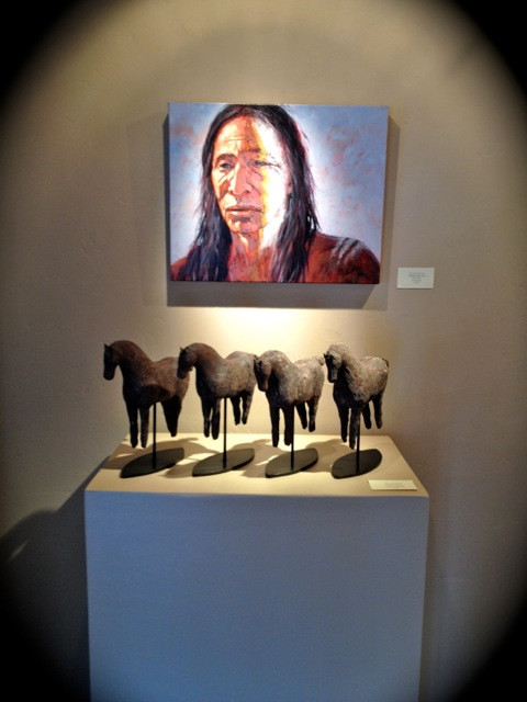
Nathan Solano's painting above Amy Laugesen's clay horse sculpture.
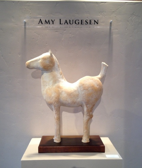
Amy Laugesen's clay horse sculpture.
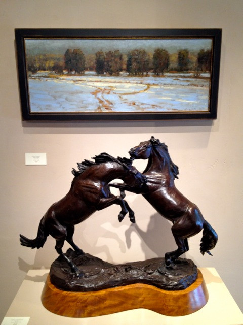
Peter Campbell's landscape above Veryl Goodnight's bronze horses.
To comment on this post please visit my blog on
The Life in Motion pieces represent the movement of life.

In life, we extend ourselves to others (left), and like the universe, life is about expanding our energy (center) so we can express ourselves with passion (right).
The simplicity and elegance of these pieces dance with the rhythm of life.

Look Studio's Life in Motion abstract photography above Neil Clifford's Bronze and granite.

Nathan Solano's painting above Amy Laugesen's clay horse sculpture.

Amy Laugesen's clay horse sculpture.

Peter Campbell's landscape above Veryl Goodnight's bronze horses.
To comment on this post please visit my blog on

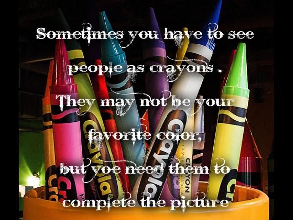
What Color is Your Crayon?—The Psychology of Color
August 8, 2014
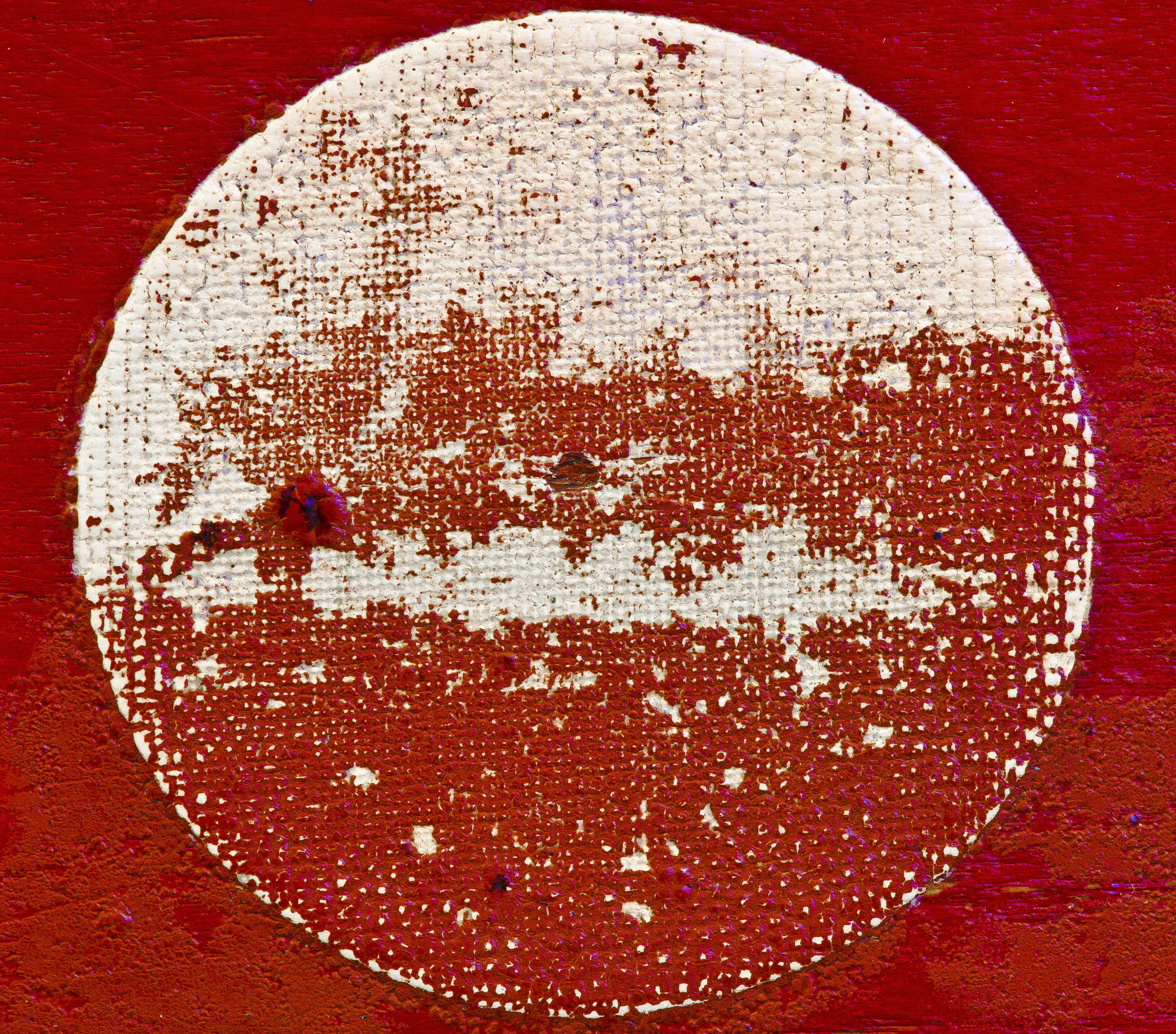
Red’s hot!...or not… A friend came into my studio recently and looked at Still Life and said “red is an angry color”, and I responded, “it’s a stimulating color”. Another friend mentioned that she used to feel sick when she was near someone wearing red! One thing is for sure, red is a powerful color. Incidentally, the friend who thinks red is “angry” loves soothing blue/green colors and he loves the water—no surprise!
Since Look Studio’s inception I’ve produced a lot of colorful abstract art. While doing so, I’ve become more and more aware of the power of color. As I watch customers respond to a color in my abstract photography favorably or not, I realize that the psychology of color is the building block to knowing how to use color in your home and may be influential in buying art. The subject of color whether it’s on your walls or in your abstract art or in a throw pillow has inspired a series of topics that will be helpful in creating the environment you want in your home.
Here are some tips for thinking through color selections:
. What mood are you trying to create?
. What colors make you feel the best?
. What colors work best for your family as a whole?
. What color can you live with day in and day out?
As you begin to think about color, check out what the experts say about color. Here are some quick resources that will help you get started:
www.iiteeeestudents.wordpress.com/tag/sigmund-freud
www.psychology.about.com/od/sensationandperception/a/colorpsych.htm
www.infoplease.com/spot/colors1.html
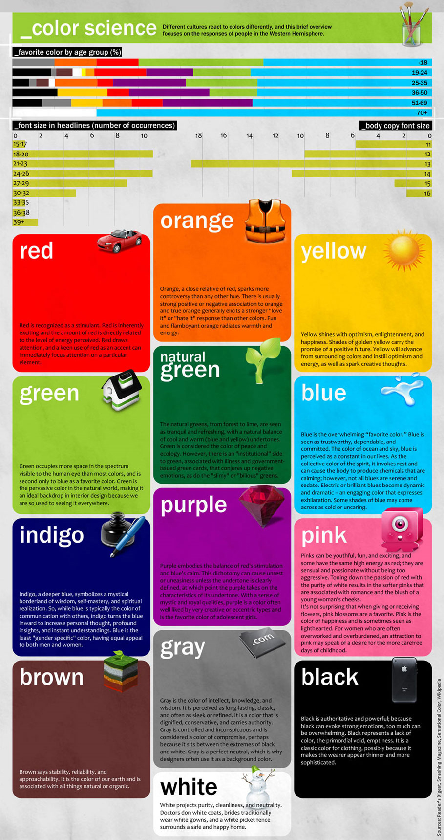
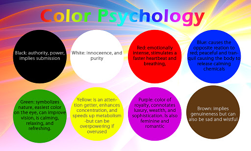
Let’s look at each of the tips for colors:
Mood – are you going for a fun/whimsical look, sophisticated look, soothing look or an organic look? You’re not just painting the wall or your house, you’re inviting people into your home and you want to create a feeling that represents who you are.
Feeling – Identify colors you like and the feelings they evoke. My favorite color is green, but I don’t want a green house or necessarily a green wall. When I was in my first apartment, I painted my furniture “dusty” blue. For some reason I thought that would look good. Later I discovered that blue depresses me and I can’t be around a lot of blue. I wasted time and energy on a color that didn’t work for me. Warmer colors make me feel good and that’s what I gravitate toward in my home.
Family – If you like pink and your partner likes brown, you’ve got some work to do. You may compromise on a taupe or beige with a hint of pink in it. Colors in the common areas need to work for the whole family. Your daughter’s room can be painted the color of “My Little Princess Pony”, but not the entire house. Actually, it can, if you love the color that much.
Lasting – Color on walls and accessories or even art is a quick and fairly easy way to change the look of your home. But it takes time and money so you want to like it for awhile. Merchandisers capitalize on trendy colors but they also change them by the day, week or month. It’s great to be aware of the trends, but make sure the color really resonates with you or you may be tired of it by next year.
Let me know your color successes and your color regrets. What’s worked for you? How compelled do you feel to use trendy colors? We’ll talk about more ideas as you narrow down your color ideas. Play with a color chart with the whole family and decide the color of your crayon. To comment on this post please visit my blog on

